All Top Navigation blocks

Top Navigation 5

Minimal center-aligned links with inline auth

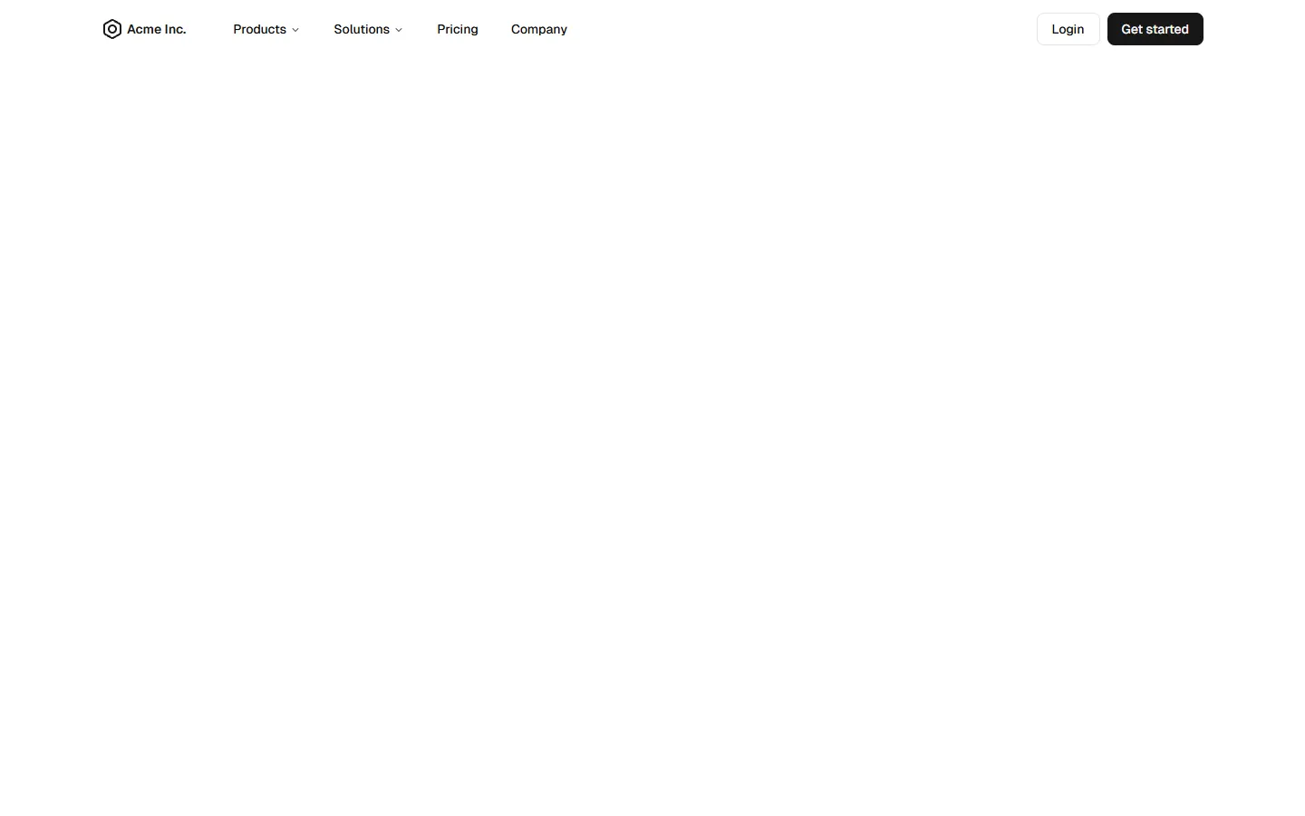
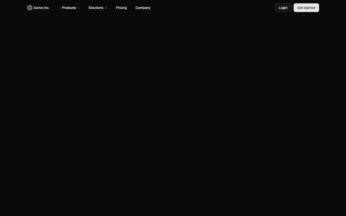
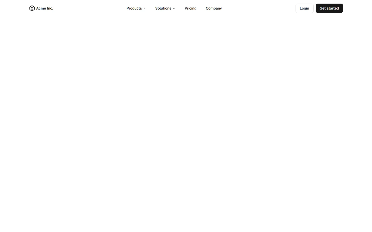
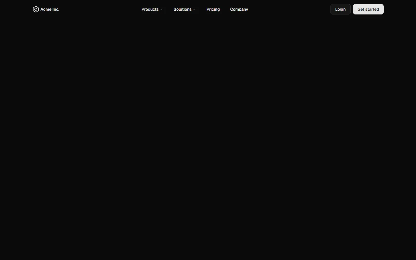
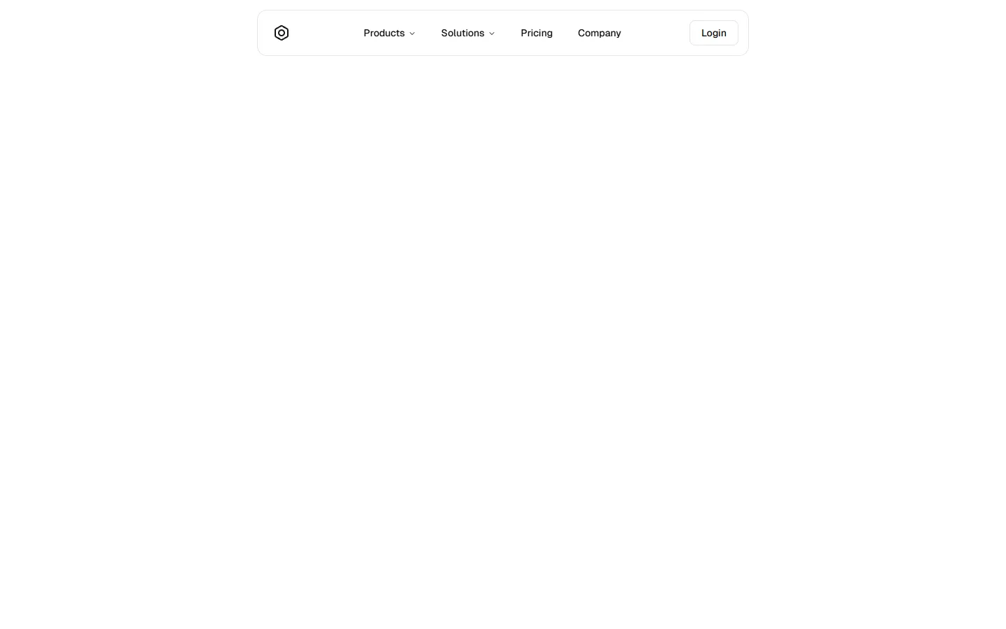
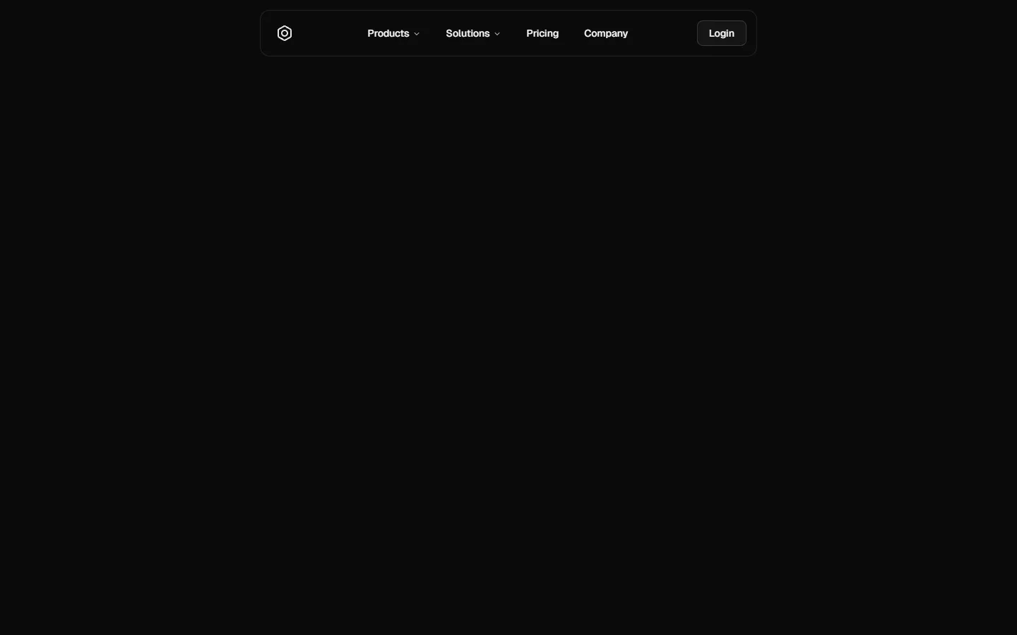
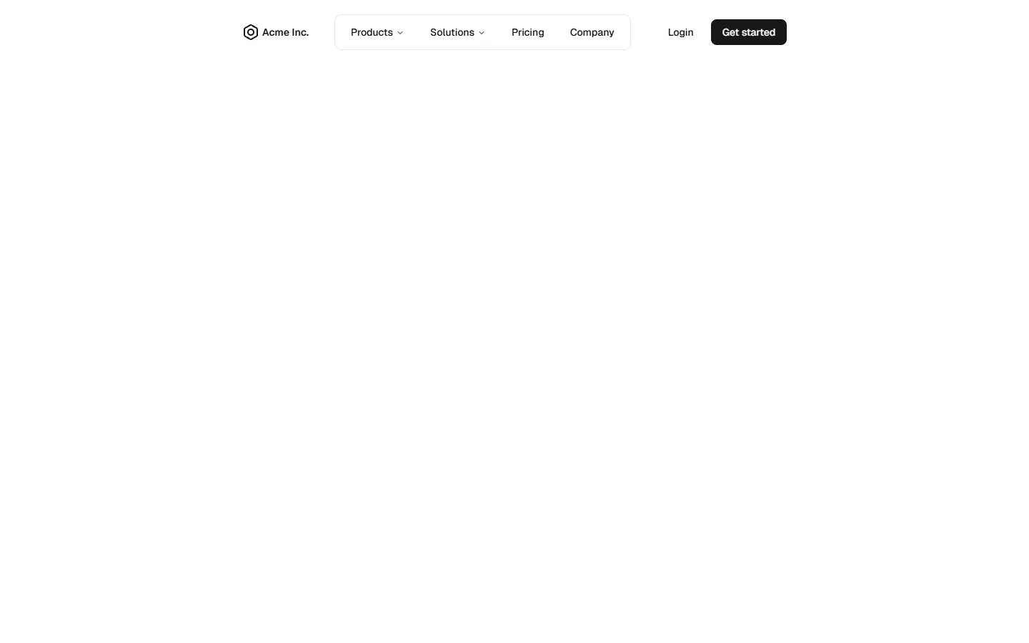
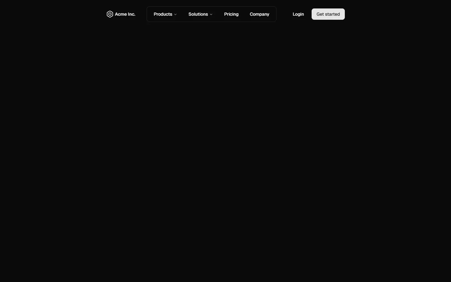
A stripped-back, center-aligned top navigation that prioritizes clarity and whitespace. Primary links sit in a single horizontal row with the brand anchored to the left and a lightweight login action on the right. On small screens, the layout collapses into a simple slide-out menu with stacked links and a single secondary action, keeping the structure familiar while reducing visual noise.

Pro Marketing Figma ReactFree
Top Navigation 5 of 5
Open in New Tab

components/shadcncraft/pro-marketing/top-navigation/top-navigation-5/index.tsx

"use client";

import { Menu, X } from "lucide-react";
import { useRef, useState } from "react";

import { Button } from "@/components/ui/button";
import { cn } from "@/lib/utils";
import { useClickOutside } from "@/hooks/use-click-outside";
import { useIsMobile } from "@/hooks/use-mobile";
import { PlaceholderLogo } from "@/components/shadcncraft/pro-marketing/placeholder-logo";

// Defaults to Tailwind's md: breakpoint.
// Change to 1024 + use lg: classes for 1024px breakpoint or whatever breakpoint you want to use
const MOBILE_BREAKPOINT = 768;

export function TopNavigation5() {
  const [isMenuOpen, setIsMenuOpen] = useState(false);
  const toggleMenu = () => setIsMenuOpen((prev) => !prev);

  const navigationContainerRef = useRef<HTMLDivElement>(null);
  const isMobile = useIsMobile(MOBILE_BREAKPOINT);

  useClickOutside(navigationContainerRef, () => {
    if (isMobile && isMenuOpen) {
      setIsMenuOpen(false);
    }
  });

  return (
    // To make this a sticky navigation, you can add `sticky top-0 z-50` classes to the parent div
    <div
      className="w-full bg-background py-3.5 transition-all ease-in-out"
      role="navigation"
      aria-label="Website top navigation"
      ref={navigationContainerRef}
    >
      <div className="relative mx-auto flex max-w-7xl flex-col justify-between gap-x-5 px-5 md:flex-row lg:gap-x-9 lg:px-8">
        {/* Logo and Toggle Mobile Nav Button */}
        <div className="flex items-center justify-between">
          {/* Replace with actual logo */}
          <a href="/" aria-label="Go to home page">
            <PlaceholderLogo />
          </a>

          {/* Toggle Mobile Nav Button - Visible on screen sizes < 768px */}
          <Button
            variant="ghost"
            size="icon"
            className="md:hidden"
            onClick={toggleMenu}
            aria-label={isMenuOpen ? "Close navigation menu" : "Open navigation menu"}
          >
            {isMenuOpen ? (
              <X className="animate-in zoom-in-50" />
            ) : (
              <Menu className="animate-in zoom-in-50" />
            )}
          </Button>
        </div>

        {/* Desktop Navigation - Visible on screen sizes ≥ 768px */}
        <div className="hidden flex-1 justify-between gap-4 md:flex md:items-center">
          <nav className="mx-auto flex items-center gap-2">
            {NAV_ITEMS.map((item) => {
              // Replace with actual active link detection

              const isActive = item.href === "/pathname";
              return (
                // Replace with actual navigation link
                <a
                  key={item.label}
                  href={item.href}
                  className={cn(
                    "rounded-md px-4 py-2 text-sm font-medium transition-colors hover:bg-accent/50 hover:text-accent-foreground",
                    isActive && "bg-accent text-accent-foreground"
                  )}
                >
                  {item.label}
                </a>
              );
            })}
          </nav>

          <ActionButtons />
        </div>

        {/* Mobile Navigation - Visible on screen sizes < 768px */}
        <div
          className={cn(
            "grid transition-all duration-300 ease-in-out md:hidden",
            isMenuOpen
              ? "grid-rows-[1fr] pt-5 opacity-100"
              : "pointer-events-none grid-rows-[0fr] opacity-0"
          )}
        >
          <div
            className={cn(isMenuOpen ? "overflow-visible" : "overflow-hidden")}
            inert={!isMenuOpen || undefined}
            aria-hidden={!isMenuOpen}
          >
            <div className="flex flex-col gap-9">
              <nav className="flex flex-col gap-2">
                {NAV_ITEMS.map((item) => {
                  // Replace with actual active link detection

                  const isActive = item.href === "/pathname";
                  return (
                    // Replace with actual navigation link
                    <a
                      key={item.label}
                      href={item.href}
                      className={cn(
                        "rounded-md px-2 py-3.5 text-base font-medium transition-colors hover:bg-accent/50 hover:text-accent-foreground",
                        isActive && "bg-accent text-accent-foreground"
                      )}
                      onClick={() => setIsMenuOpen(false)}
                    >
                      {item.label}
                    </a>
                  );
                })}
              </nav>

              <ActionButtons />
            </div>
          </div>
        </div>
      </div>
    </div>
  );
}

function ActionButtons() {
  return (
    <div className="flex flex-col gap-2 md:flex-row">
      <Button variant="outline" className="w-full md:w-fit">
        Login
      </Button>
    </div>
  );
}

const NAV_ITEMS = [
  { label: "Products", href: "#" },
  { label: "Solutions", href: "#" },
  { label: "Pricing", href: "#" },
  { label: "Company", href: "#" },
];

Top Navigation 5 is available as part of our Pro and Pro + React Design Systems. Get Top Navigation 5

Benefits

Production-ready by default

Built with shadcn/ui conventions and designed for real projects.

Built with shadcn/ui

Clean React components using Tailwind and modern shadcn patterns.

Install instantly

Add the block directly using the shadcn CLI.

Works with your theme

Compatible with shadcn themes and token-based color systems.

MCP server support

Use shadcn MCP server right from your favorite AI tools.

Frequently Asked Questions

Quick FAQs to get you started.
Still have questions? See all FAQs, or get support.

Yes. They follow shadcn/ui structure and are built for real products.

SBIOTJ

Join 3,000+ builders shipping with shadcncraft

Design and assemble full pages faster with production-ready blocks built for real products.

  • Production-ready blocks and components
  • Clean React and Tailwind parity
  • Built for SaaS, marketing, and ecommerce teams
Get the design system
Join Now CTA

Real support from the team behind shadcncraft

Get help within 24 hours from the people who build and maintain the system.

Email
Prefer a direct line? Send us a message and we'll get back to you as soon as possible.
Discord
Get quick support, share feedback, or connect with other builders.
Feedback
Got something to say about anything shadcncraft? We'd love to hear it.