shadcn/ui components, blocks, and Figma kit, built for AI workflows
Trusted by top teams

282 production-ready shadcn/ui blocks
Try it live! Switch blocks and customize them
Browse all 282 shadcn/ui blocks
shadcn vs shadcncraft
shadcn
No official Figma UI kit
shadcncraft
Complete Figma UI kit with theming and component states
shadcn
Open source component primitives
shadcncraft
Production-ready components built on shadcn
shadcn
Assemble UI from scratch
shadcncraft
Start from real blocks and full pages
shadcn
Assembly required — you compose the UI
shadcncraft
Pre-structured UI that works out of the box
shadcn
Code-only — no design layer for AI to read
shadcncraft
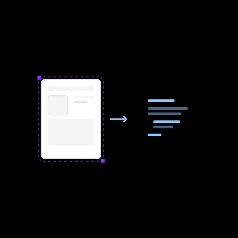
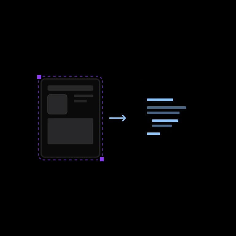
Works with Figma MCP for AI-assisted design-to-code
Make your shadcn apps look, feel, and sound like you.
We built UI Rules as a companion to shadcncraft. Connect your design system guidelines to AI, so it knows how your components come together, how your app behaves, and how your brand speaks.
The what.
What your app is made of. The components, blocks, and apps you build with.
The how.
Your styles and guidelines. How your app looks, feels, and sounds.
The perfect complement to shadcncraft.
One home. Always up to date.
Keep your guidelines in one place and connect via MCP. Give your AI tools the latest guidance for every build.
Your styles, from the start.
Let AI apply your styles automatically. Start every new shadcn app with your brand already in place.
Start with the best thinking.
Build on guidelines from leading design system teams. Make their best practices part of every app.
“Now all my agents had a common place to dig into, and instead of 100 rules scattered around requirement docs, CLAUDE.md, memory etc there is a central repo for it. Like Git but for design rules.”

Built for modern development workflows
Why I built shadcncraft
shadcn/ui is a modern, composable component system for React built on Tailwind CSS. It gives developers control and flexibility.
After years building design systems for large product teams, I saw a gap in the shadcn/ui ecosystem. The core is powerful, but many block libraries prioritize speed over structure.
I built shadcncraft to extend shadcn/ui the right way — with production-ready components, blocks, and themes for Figma and React, designed for teams shipping real products.
Learn more about how shadcncraft builds on shadcn/ui.124 production-ready shadcn/ui components
Browse all 124 shadcn/ui components
Looking for something specific? Browse all shadcn/ui components.
Trusted by shadcn and builders across 𝕏
Create shadcn styles and generate React code from Figma
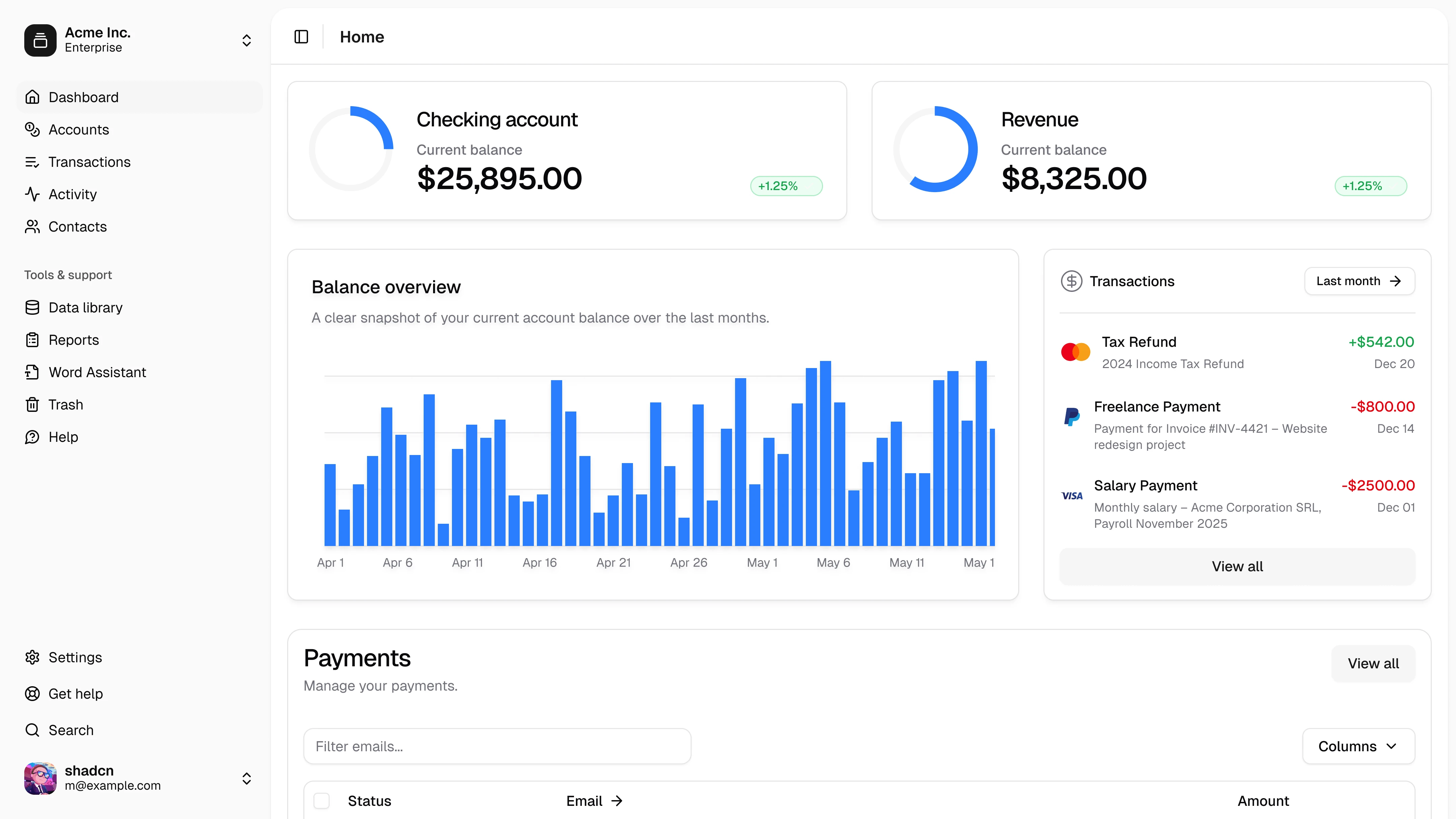
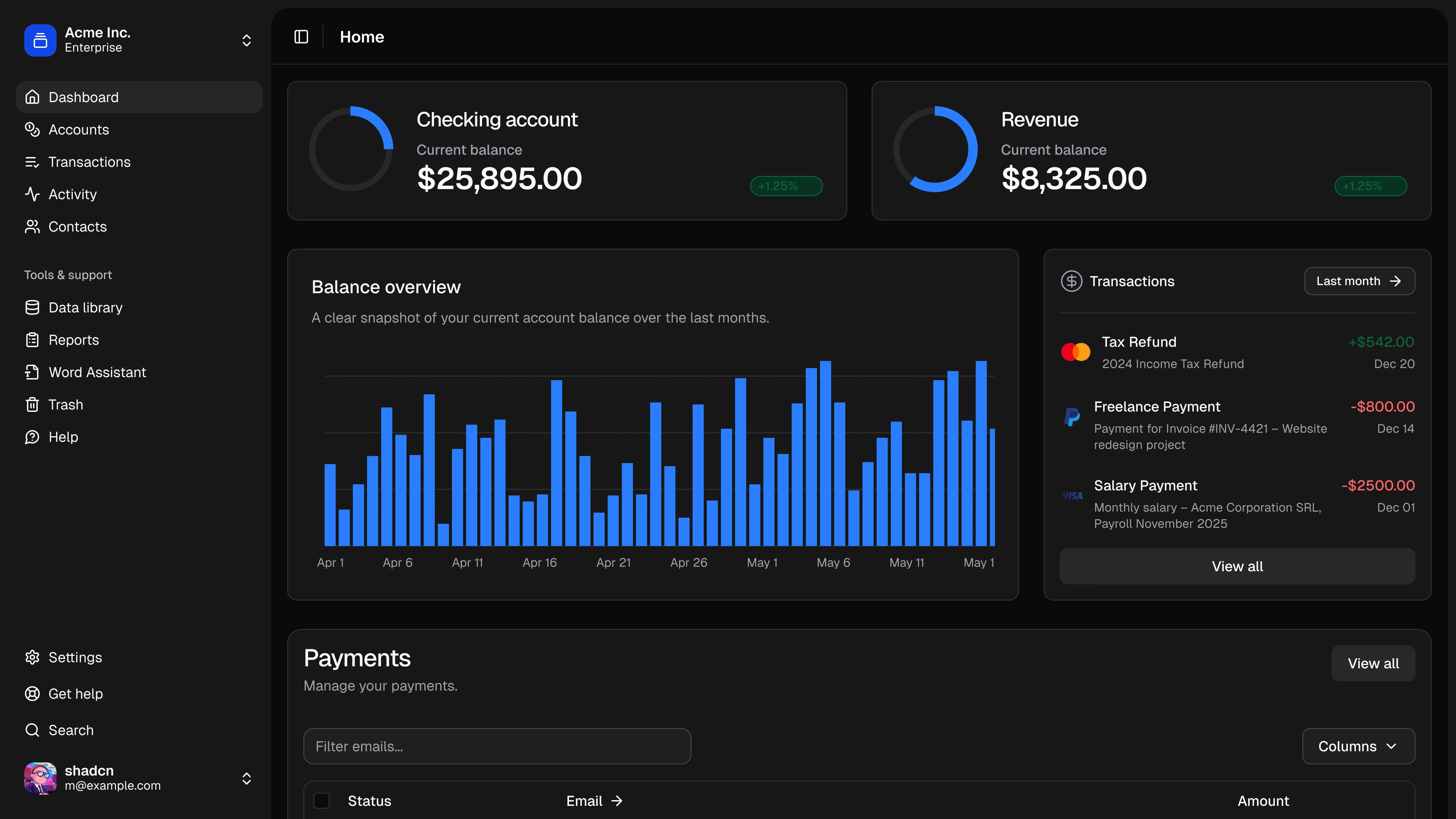
Complete production-ready layouts built on shadcn/ui
Want to talk through options? Book a free call with me, from tailored enterprise billing to picking your first bundle.
Frequently Asked Questions
shadcncraft is a production-ready design system built on shadcn/ui. It includes a Figma UI kit and matching React components with one-to-one alignment between design and code.
Design it once. Ship it exactly.