Top Navigation 3
Compact bar with progressive disclosure
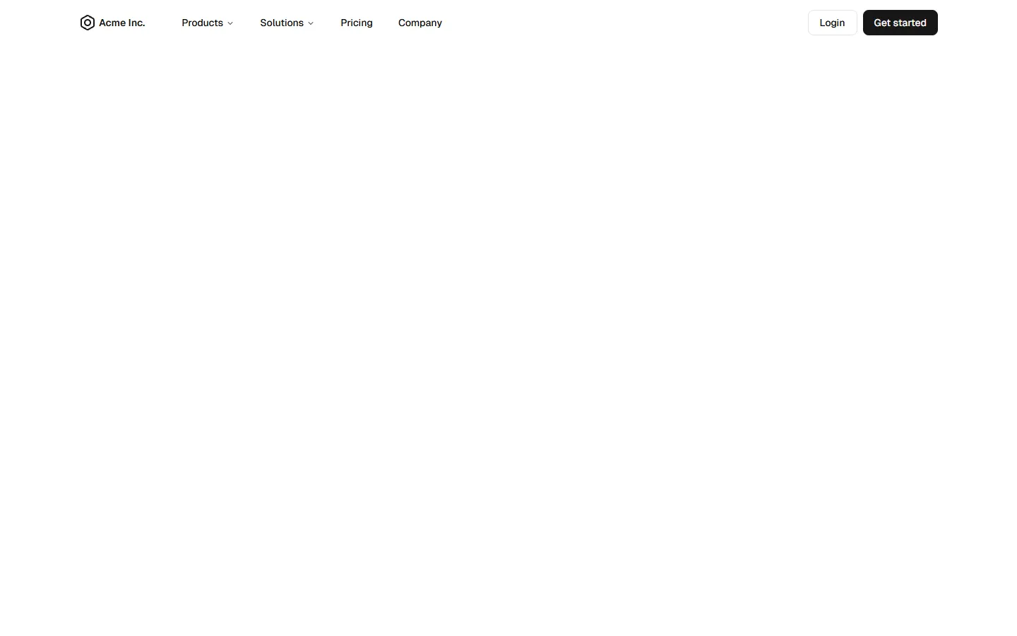
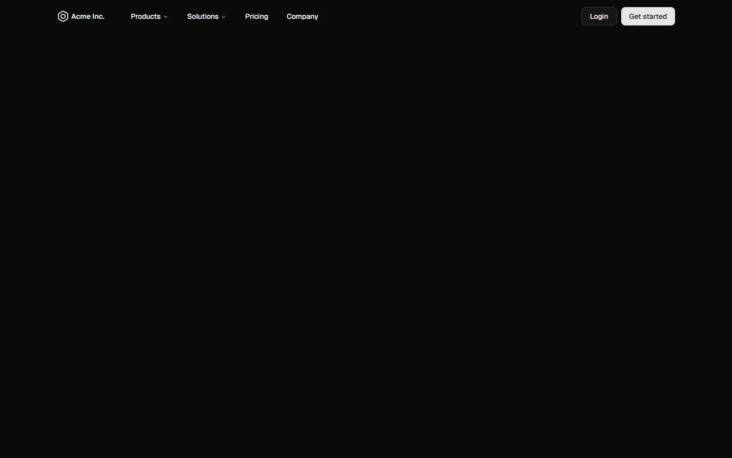
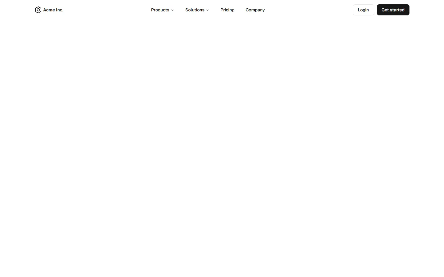
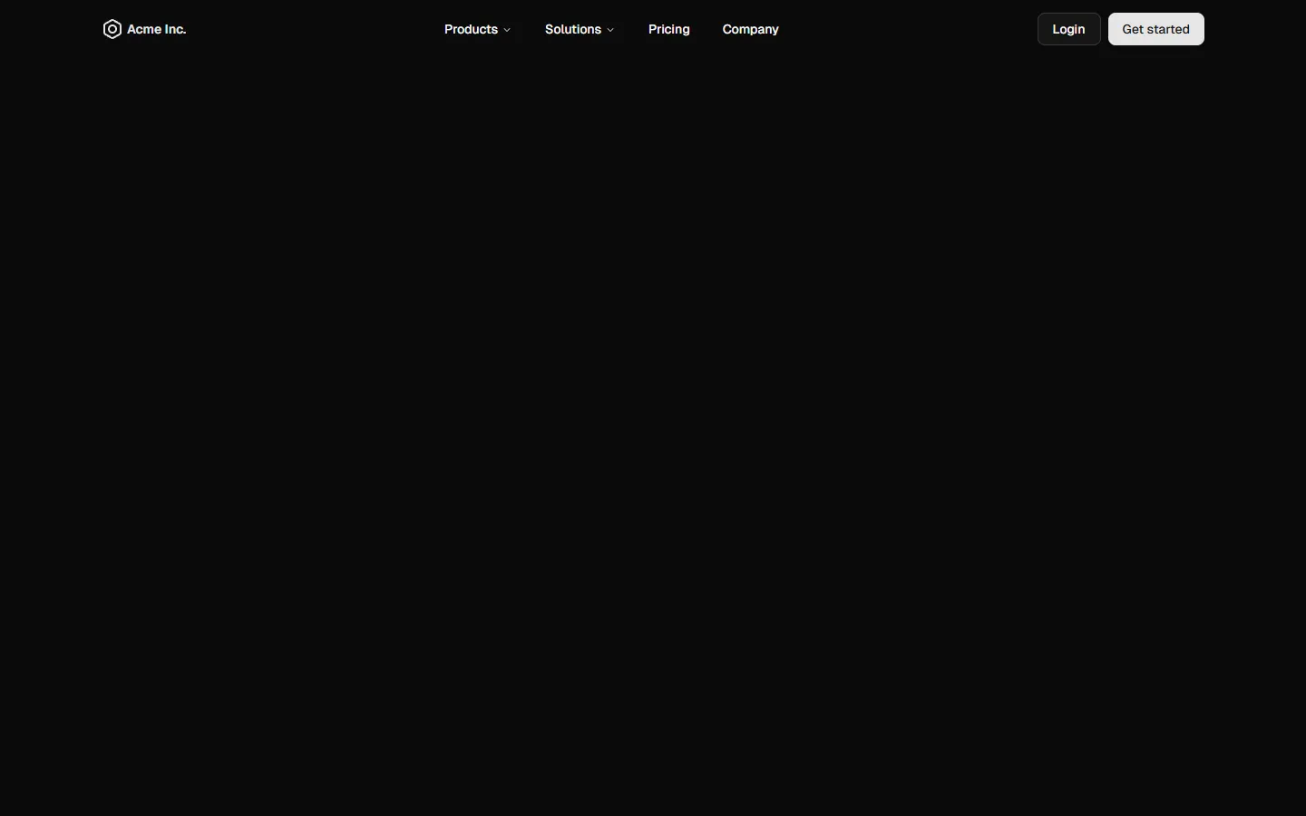
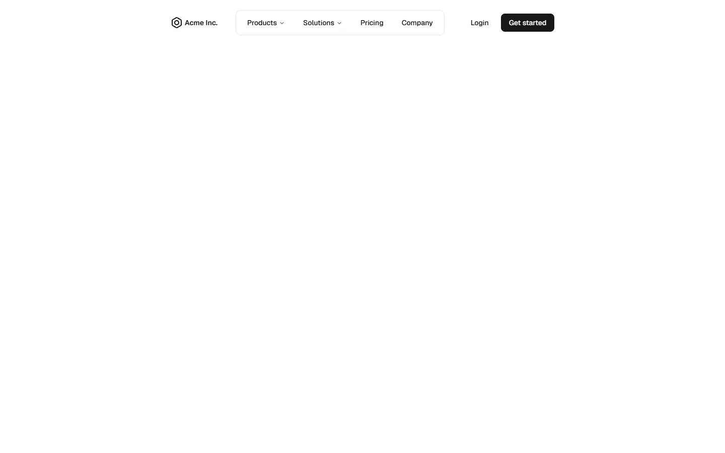
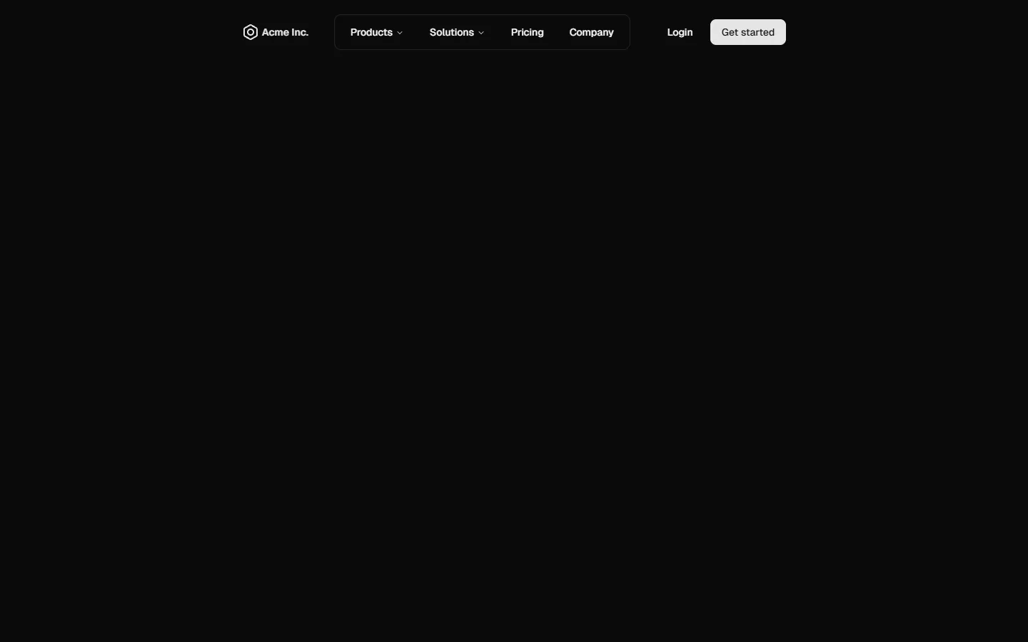
A compact top navigation that keeps the large-screen layout minimal and low-profile, with primary links arranged in a single horizontal bar. Dropdowns reveal richer, icon-led menus only when needed, keeping visual noise down by default. On smaller screens, the same structure expands into a stacked, panel-style menu with nested sections, preserving hierarchy while shifting emphasis to vertical scanning and tap targets.
Top Navigation 3 is available as part of our Pro and Pro + React Design Systems. Get Top Navigation 3
Production-ready by default
Built with shadcn/ui conventions and designed for real projects.
Clean React components using Tailwind and modern shadcn patterns.
Add the block directly using the shadcn CLI.
Compatible with shadcn themes and token-based color systems.
Use shadcn MCP server right from your favorite AI tools.
Frequently Asked Questions
Quick FAQs to get you started.
Still have questions? See all FAQs, or get support.
Yes. They follow shadcn/ui structure and are built for real products.
