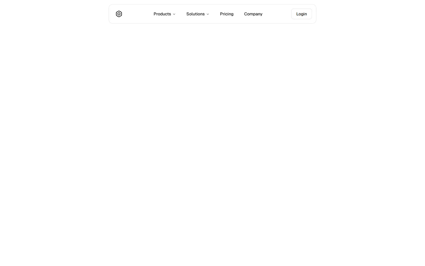
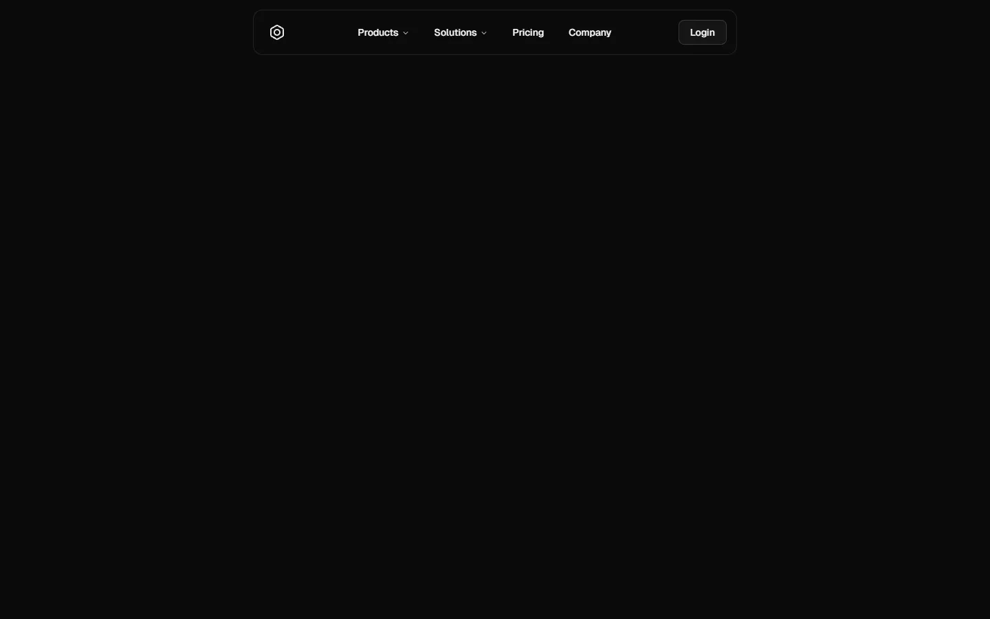
Top Navigation 4
Centered pill navigation with dropdown menu
A centered top navigation where primary links sit inside a pill-style container, creating a strong visual anchor across large screens. Dropdown menus open from the center group to reveal secondary links in a compact panel. On small screens, the layout collapses into a full-height drawer with stacked links and clear primary actions, maintaining the same information structure while prioritizing tap comfort and readability.
Top Navigation 4 is available as part of our Pro and Pro + React Design Systems. Get Top Navigation 4
Production-ready by default
Built with shadcn/ui conventions and designed for real projects.
Clean React components using Tailwind and modern shadcn patterns.
Add the block directly using the shadcn CLI.
Compatible with shadcn themes and token-based color systems.
Use shadcn MCP server right from your favorite AI tools.
Frequently Asked Questions
Quick FAQs to get you started.
Still have questions? See all FAQs, or get support.
Yes. They follow shadcn/ui structure and are built for real products.
