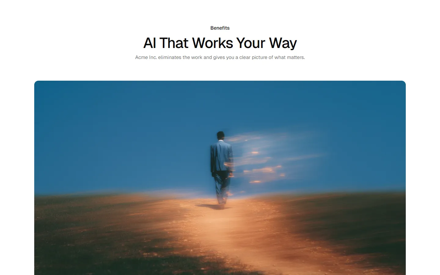
Benefits 5
Icon grid
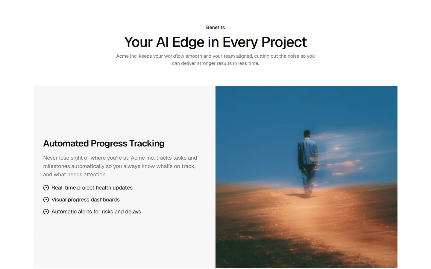
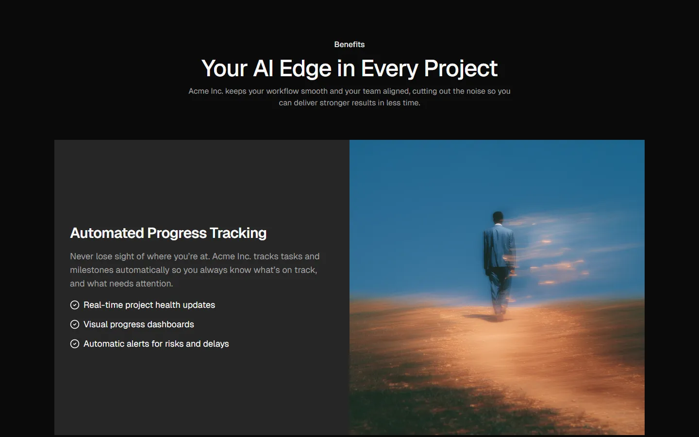
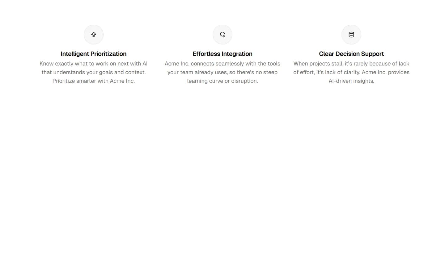
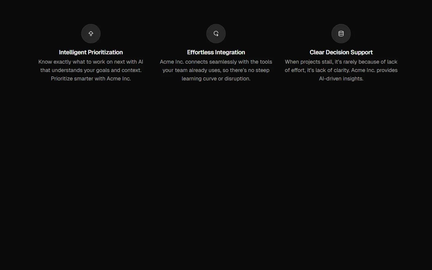
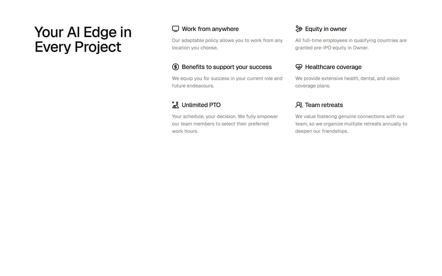
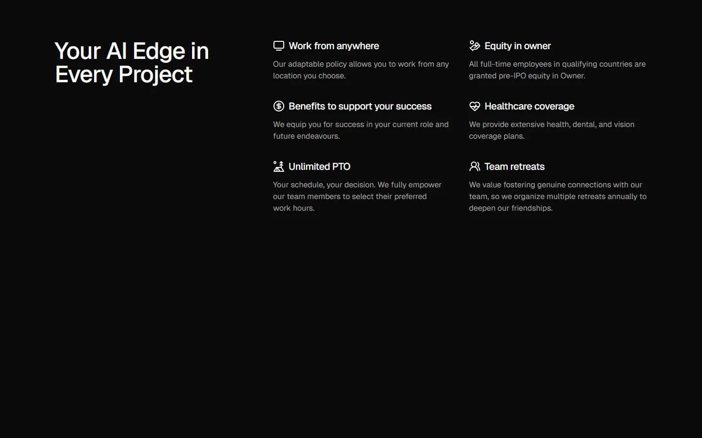
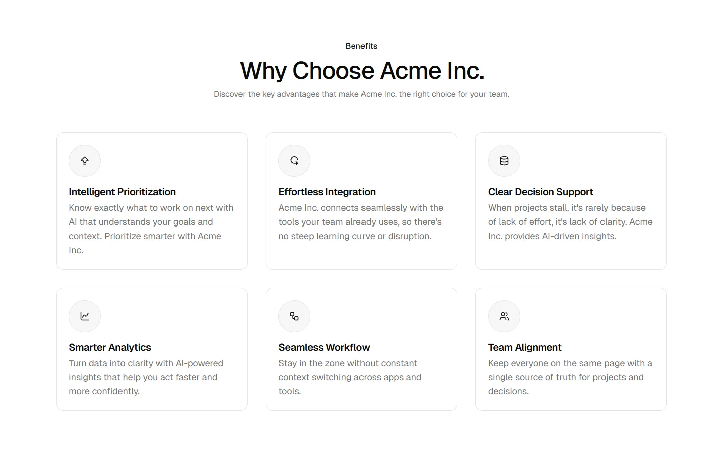
A benefits block with a headline and short intro, followed by a grid of icon-led features arranged in two rows. Each item includes an icon, feature name, and short description. Use to present a broad set of product benefits at a glance without visuals or calls to action.
Benefits 5 is available as part of our Pro and Pro + React Design Systems. Get Benefits 5
More Benefits


Production-ready by default
Built with shadcn/ui conventions and designed for real projects.
Clean React components using Tailwind and modern shadcn patterns.
Add the block directly using the shadcn CLI.
Compatible with shadcn themes and token-based color systems.
Use shadcn MCP server right from your favorite AI tools.
Frequently Asked Questions
Quick FAQs to get you started.
Still have questions? See all FAQs, or get support.
Yes. They follow shadcn/ui structure and are built for real products.
