Benefits 2
Alternating rows with actions and image
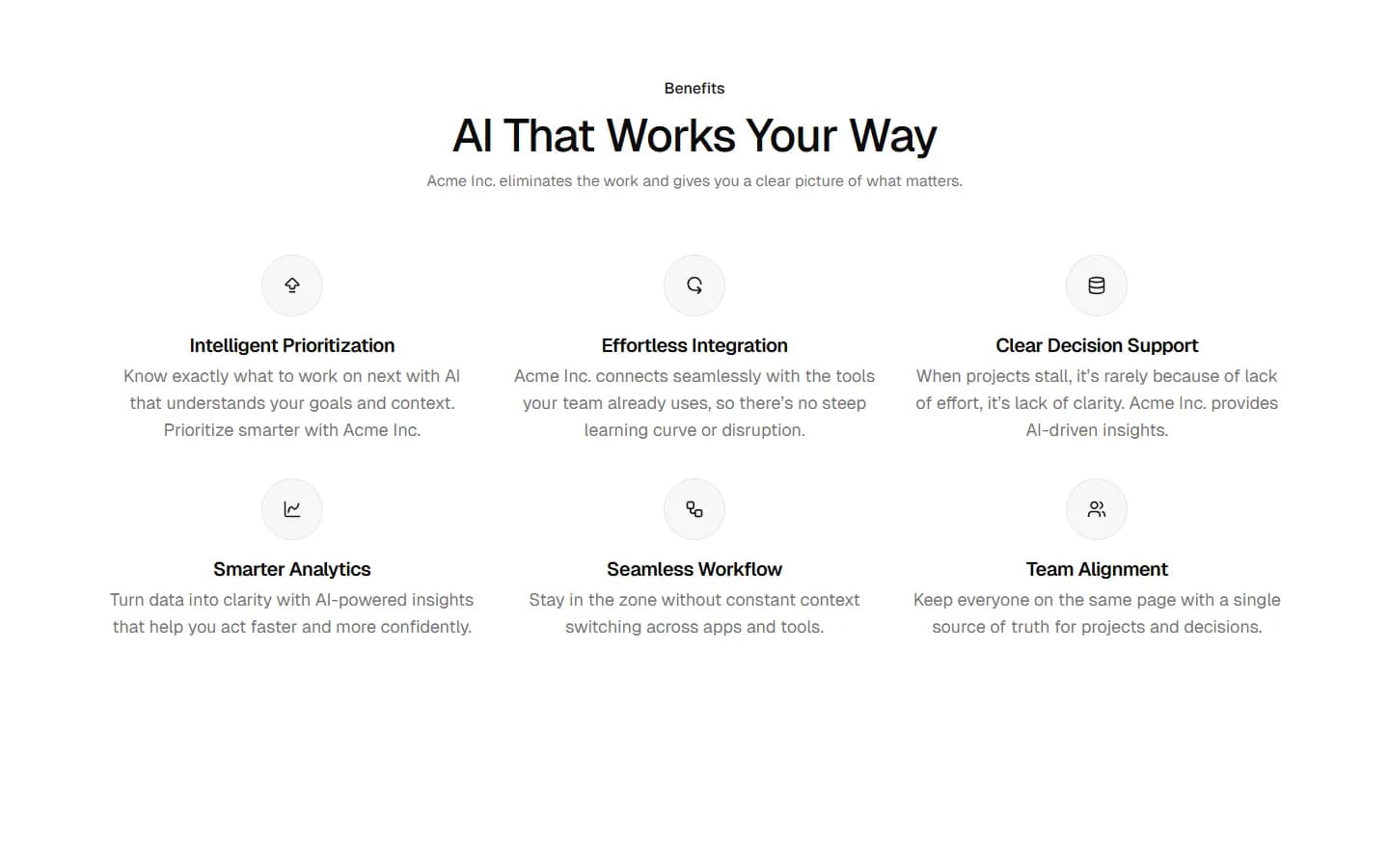
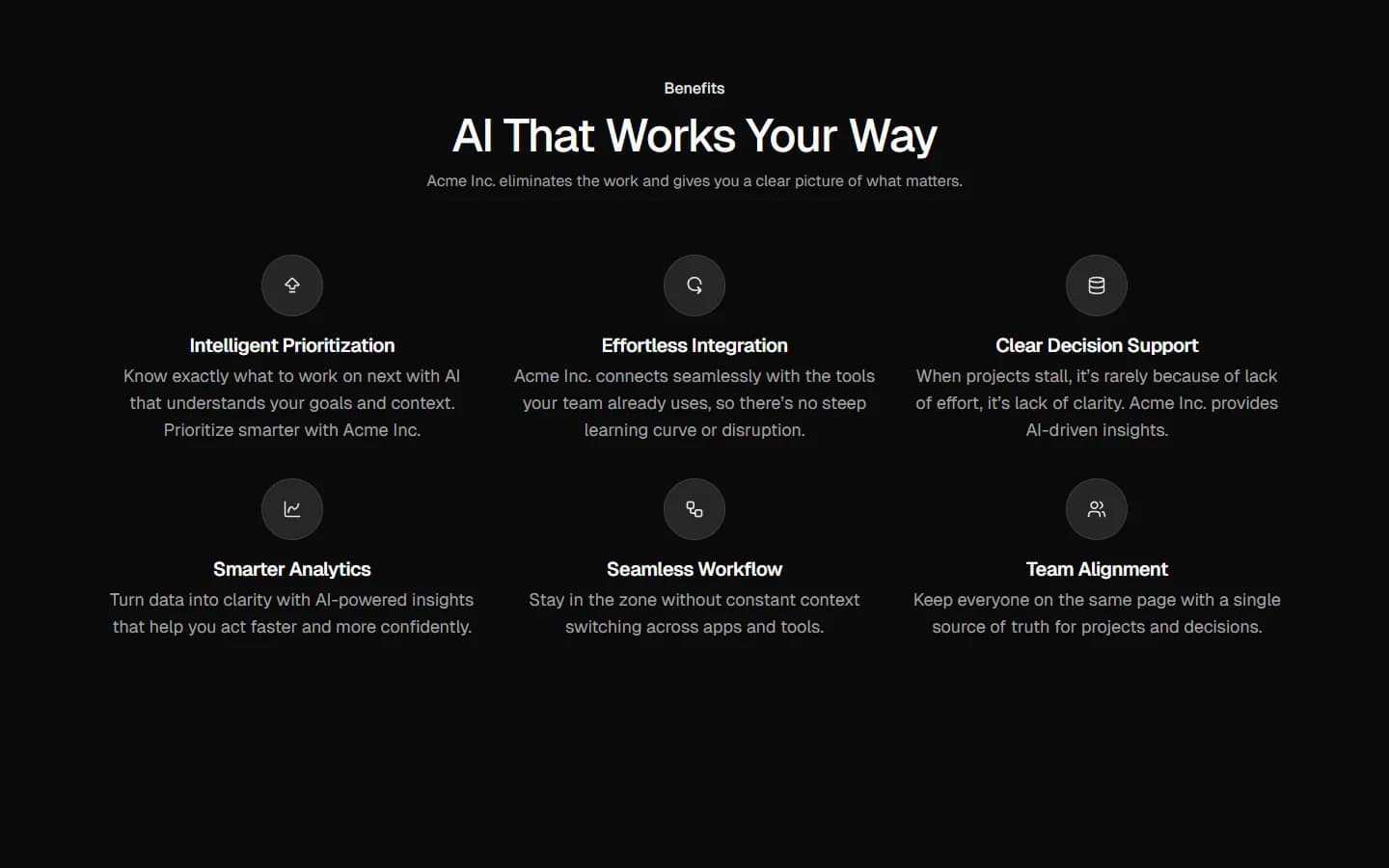
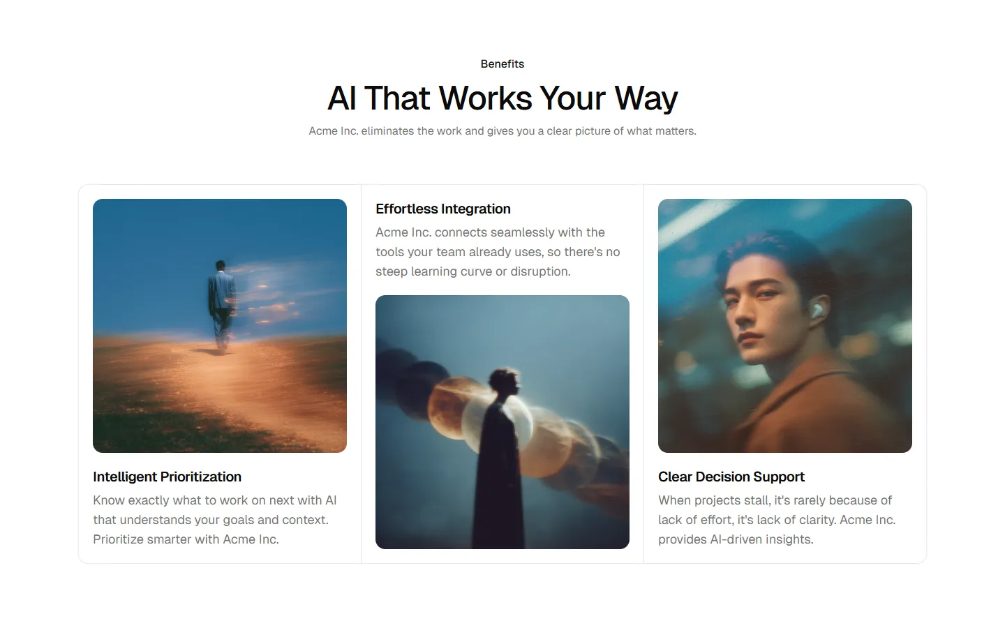
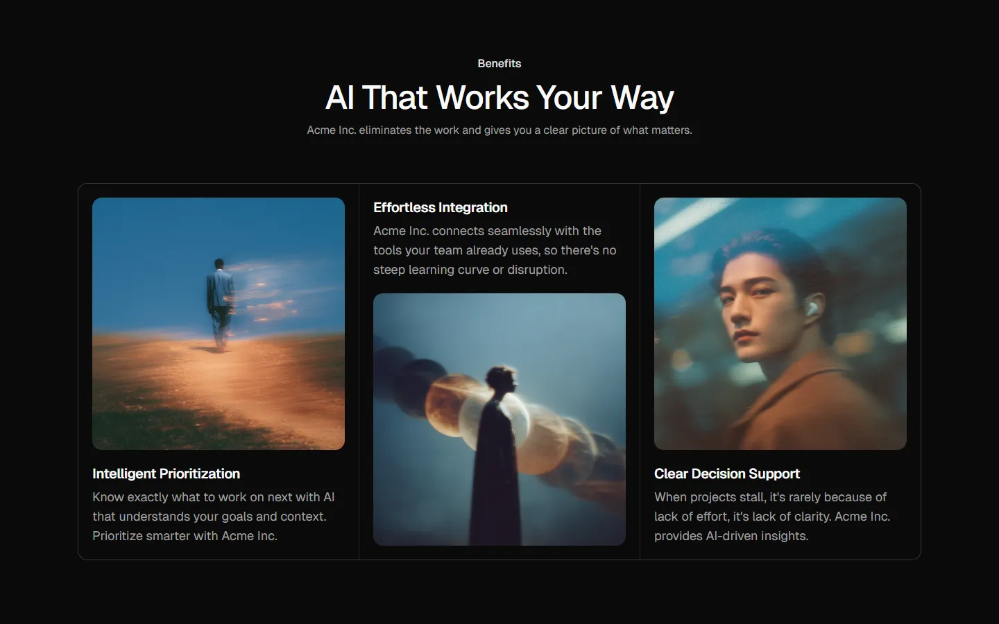
A benefits section with a headline and intro, followed by multiple feature cards arranged in a staggered grid. Each card includes an icon, feature title, short description, supporting UI image, and primary actions. Use to present key product capabilities when you want each feature to stand alone and drive clicks to demos or deeper pages.
Benefits 2 is available as part of our Pro and Pro + React Design Systems. Get Benefits 2
More Benefits


Production-ready by default
Built with shadcn/ui conventions and designed for real projects.
Clean React components using Tailwind and modern shadcn patterns.
Add the block directly using the shadcn CLI.
Compatible with shadcn themes and token-based color systems.
Use shadcn MCP server right from your favorite AI tools.
Frequently Asked Questions
Quick FAQs to get you started.
Still have questions? See all FAQs, or get support.
Yes. They follow shadcn/ui structure and are built for real products.
