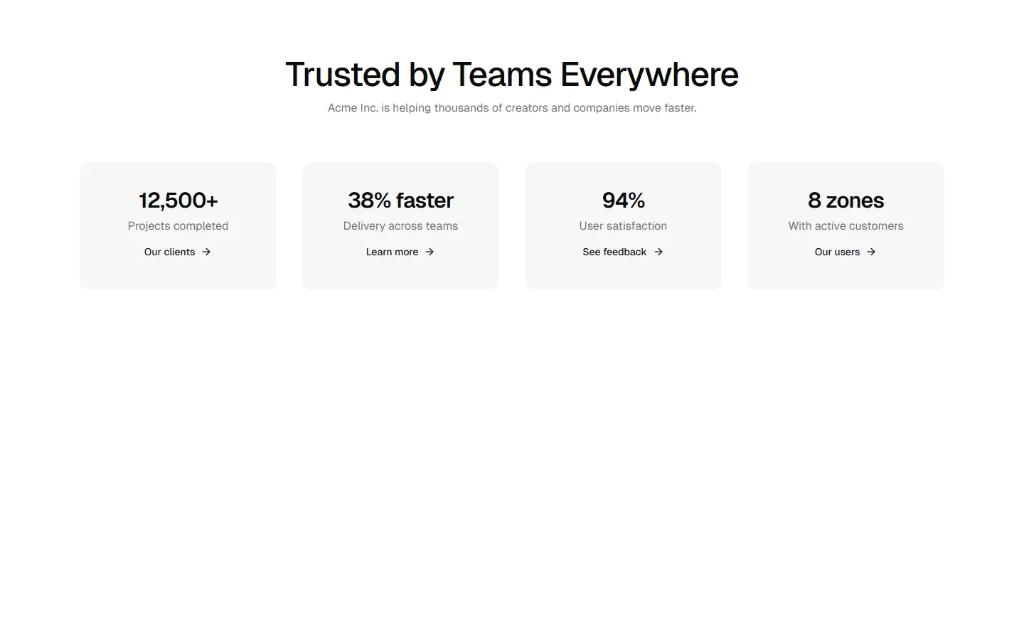
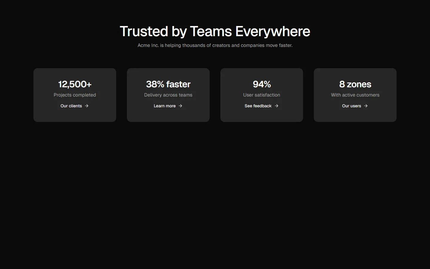
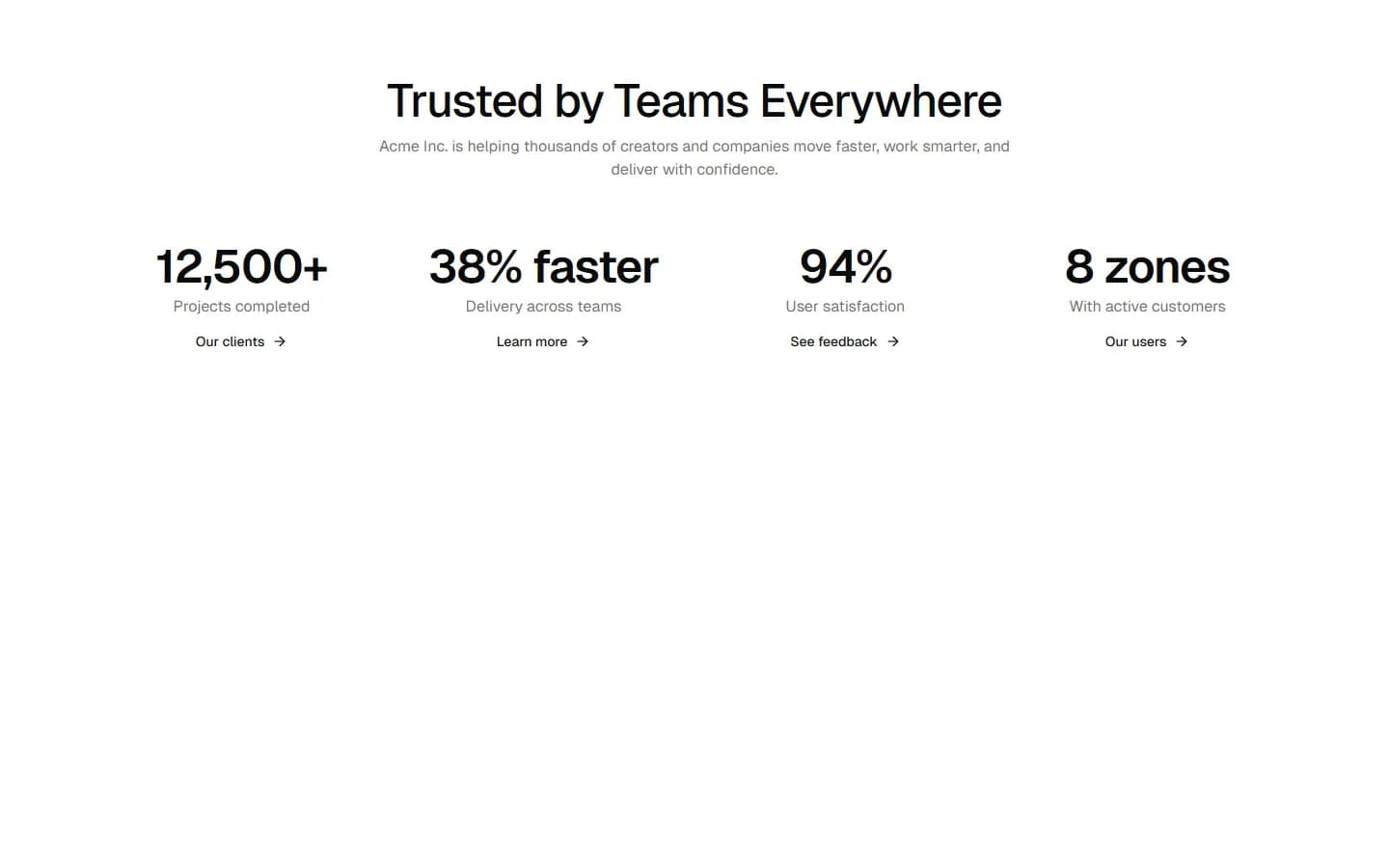
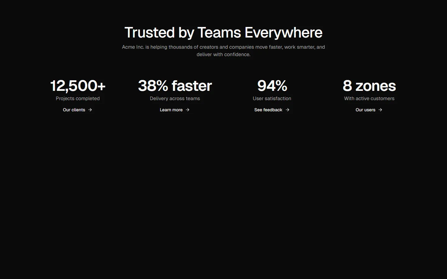
Metrics 6
Inline metrics with dividers
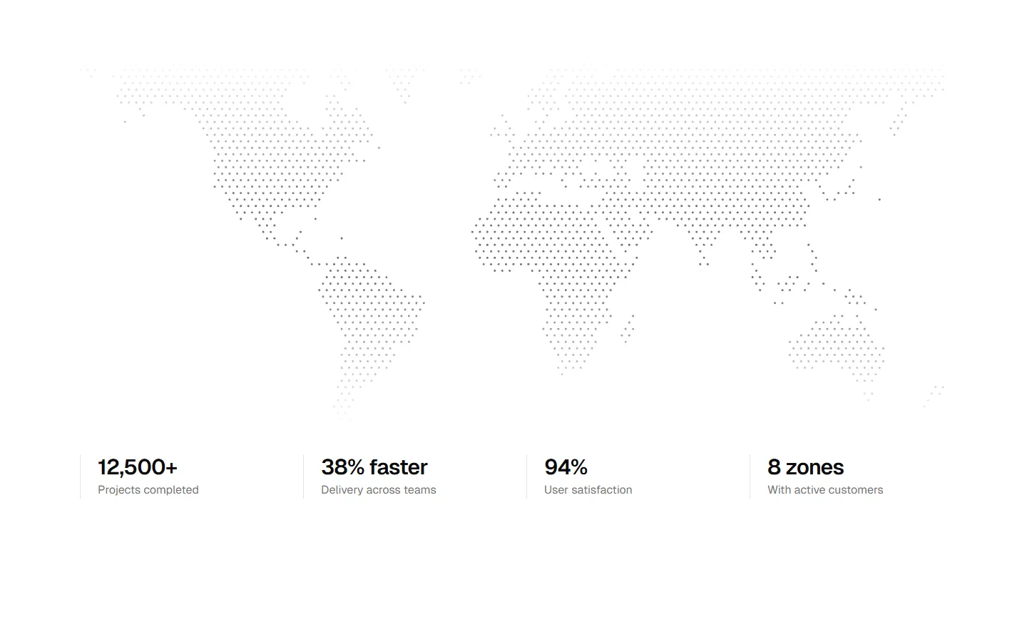
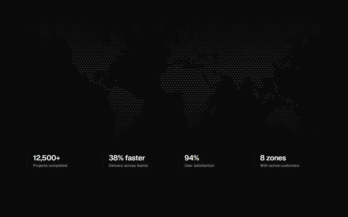
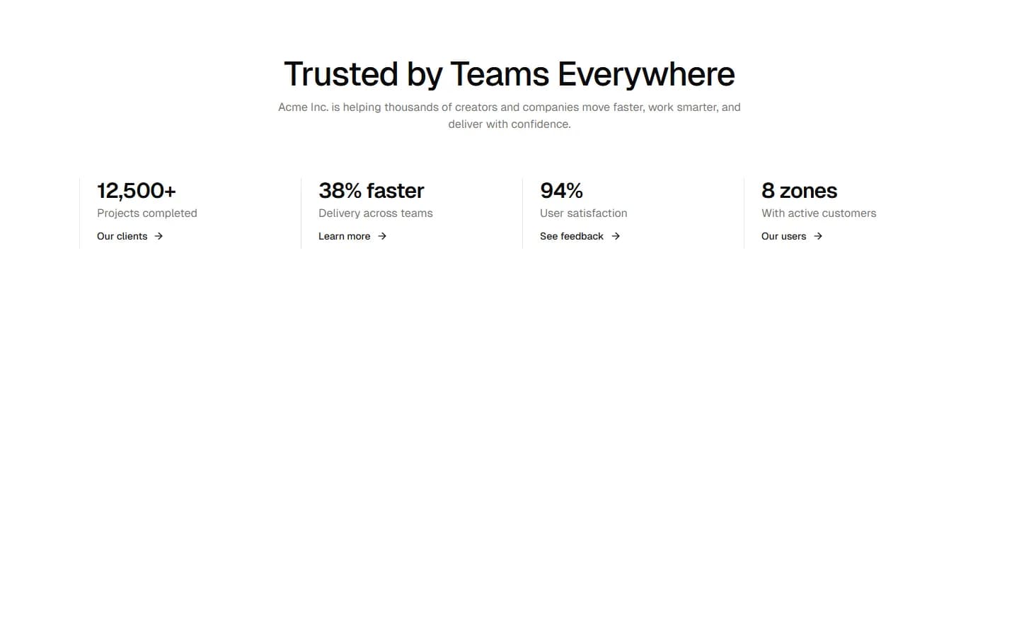
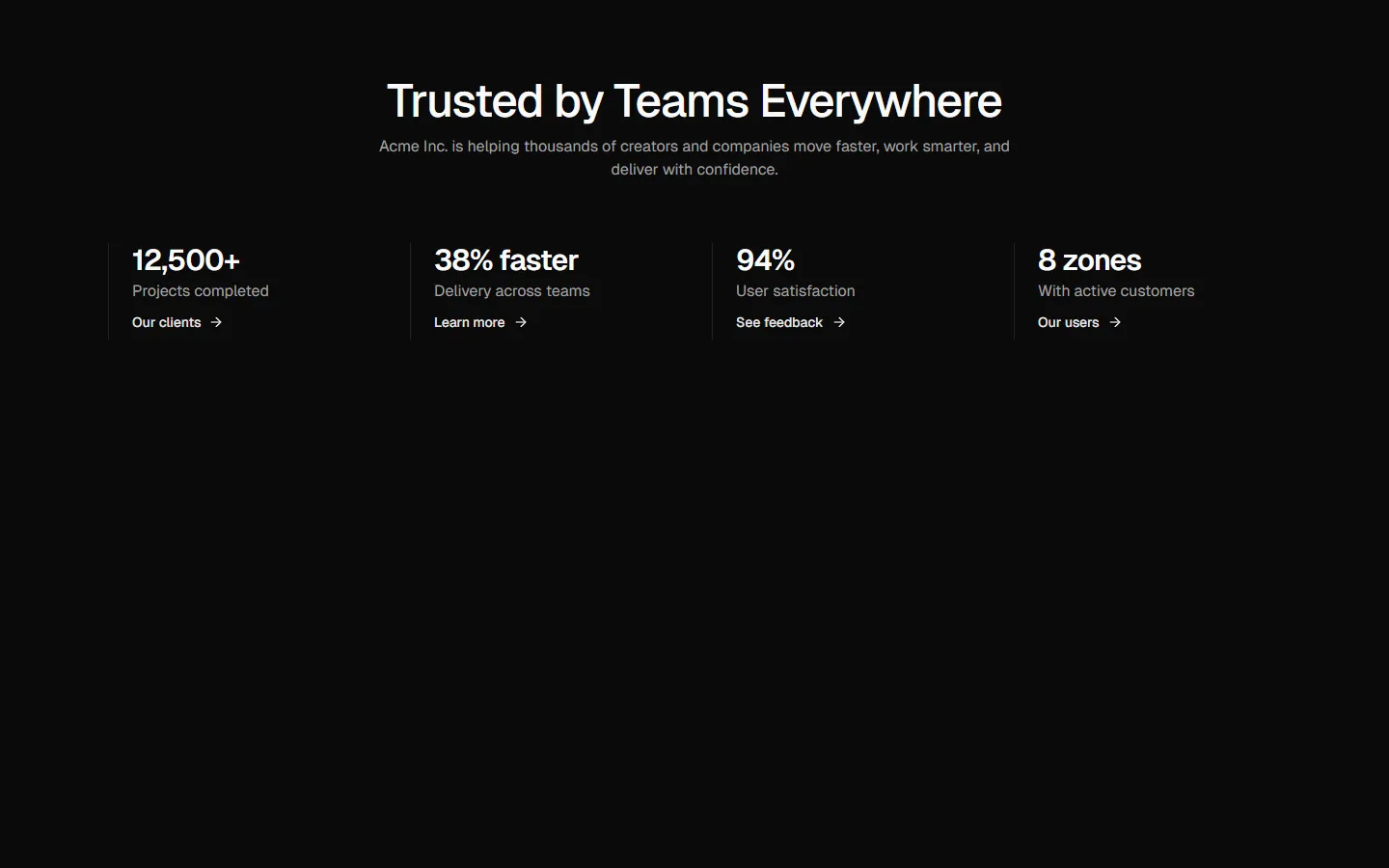
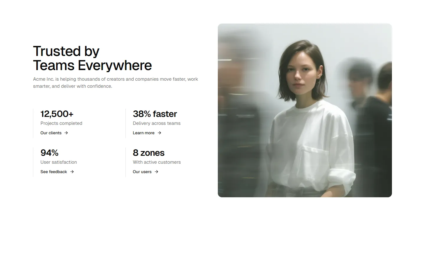
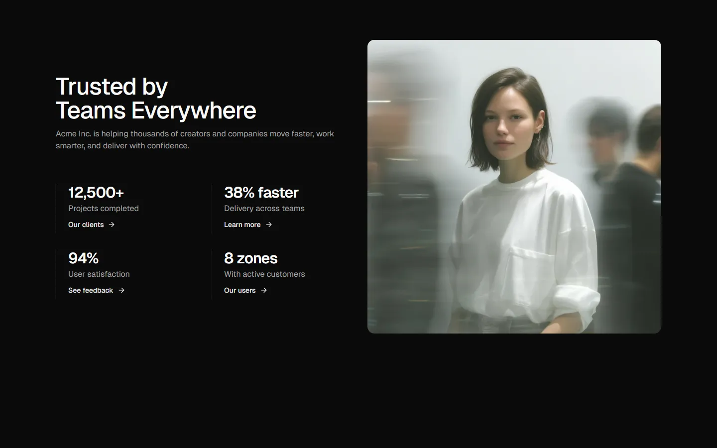
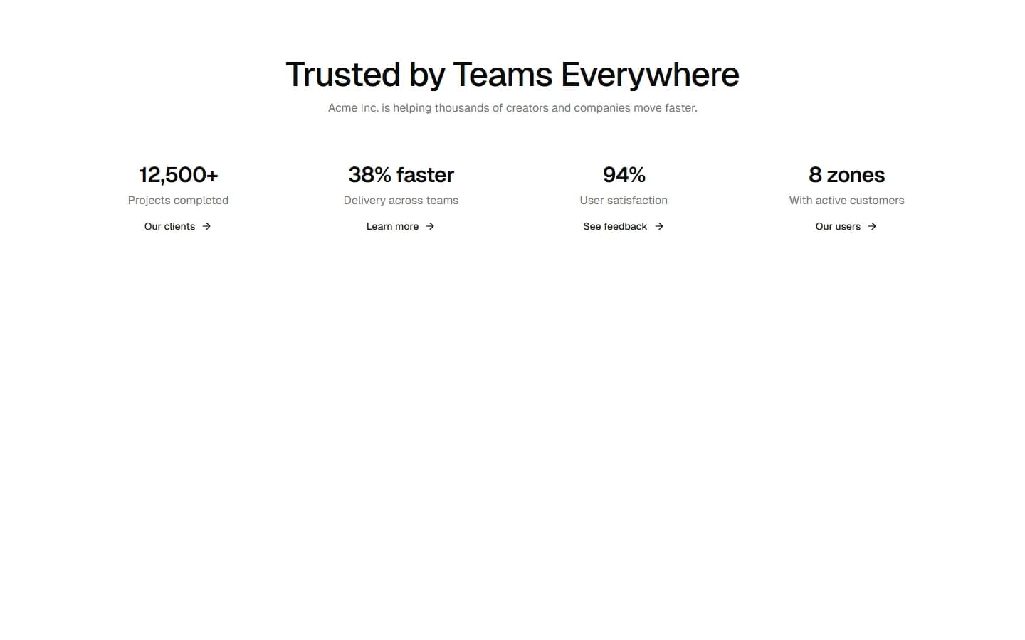
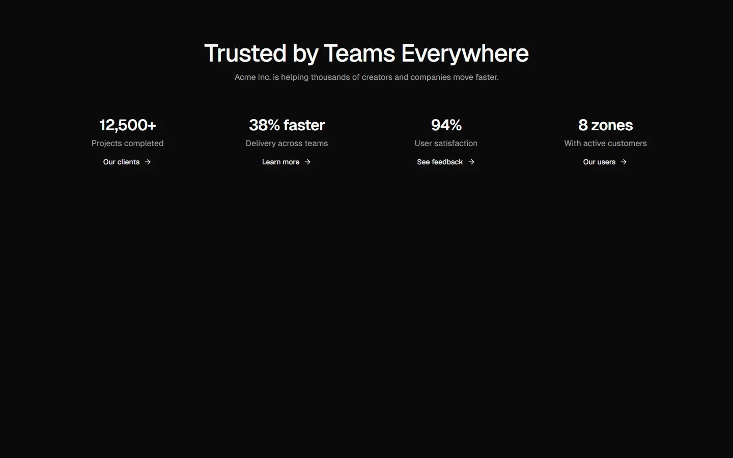
A single-row metrics layout that uses subtle vertical dividers instead of cards. This keeps the section feeling light and flat while still giving each metric clear separation. Works well when metrics are supporting evidence rather than the main focal point. On smaller screens, the metrics stack into a clean vertical list with the same divider rhythm preserved.
Metrics 6 is available as part of our Pro and Pro + React Design Systems. Get Metrics 6
Production-ready by default
Built with shadcn/ui conventions and designed for real projects.
Clean React components using Tailwind and modern shadcn patterns.
Add the block directly using the shadcn CLI.
Compatible with shadcn themes and token-based color systems.
Use shadcn MCP server right from your favorite AI tools.
Frequently Asked Questions
Quick FAQs to get you started.
Still have questions? See all FAQs, or get support.
Yes. They follow shadcn/ui structure and are built for real products.
