Hero 6
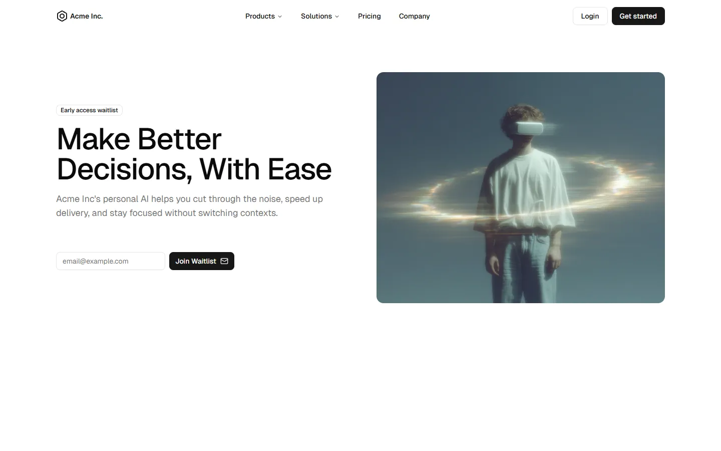
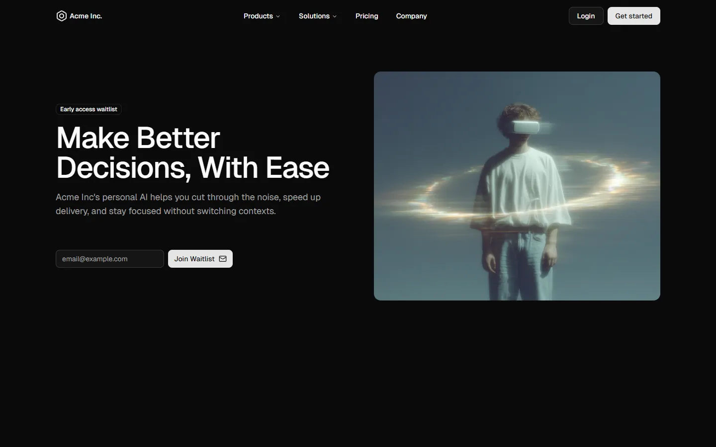
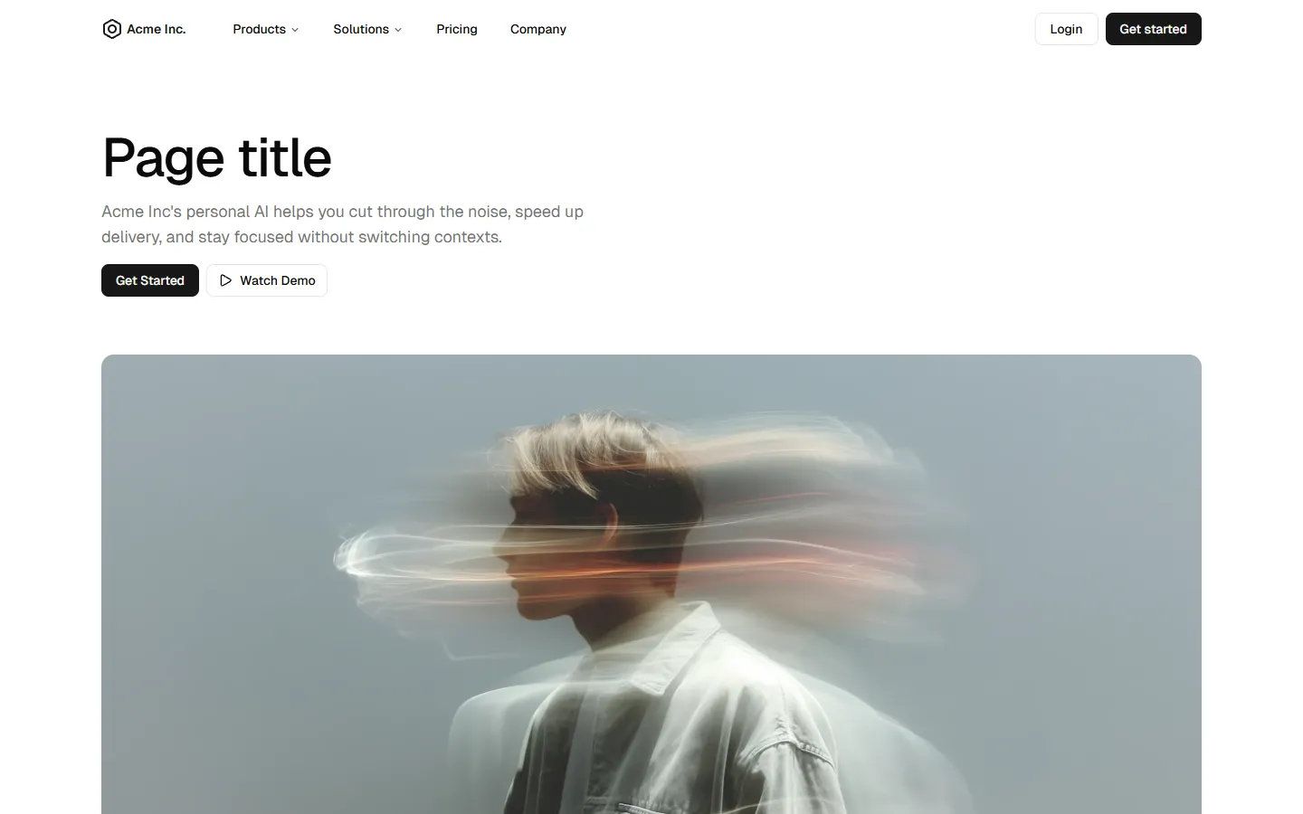
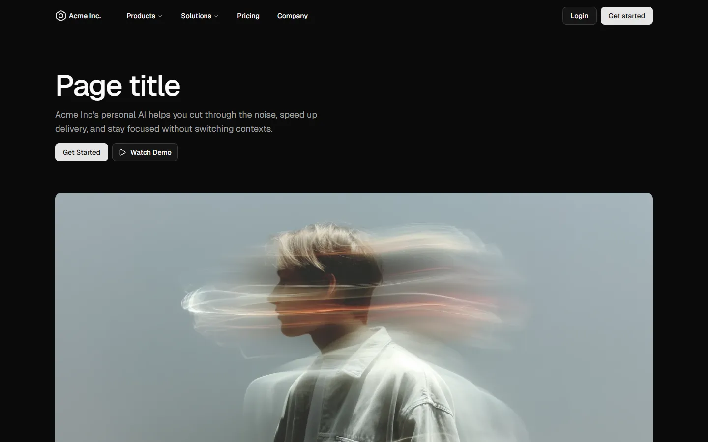
Feature-led split hero
A practical split hero that pairs a strong visual with a short benefits list. Designed to quickly explain value through scannable points, with a clear primary CTA. Works well for product-led pages where clarity and speed to understanding matter more than mood alone.
Hero 6 is available as part of our Pro and Pro + React Design Systems. Get Hero 6
More Heroes


Production-ready by default
Built with shadcn/ui conventions and designed for real projects.
Clean React components using Tailwind and modern shadcn patterns.
Add the block directly using the shadcn CLI.
Compatible with shadcn themes and token-based color systems.
Use shadcn MCP server right from your favorite AI tools.
Frequently Asked Questions
Quick FAQs to get you started.
Still have questions? See all FAQs, or get support.
Yes. They follow shadcn/ui structure and are built for real products.
