CTA 6
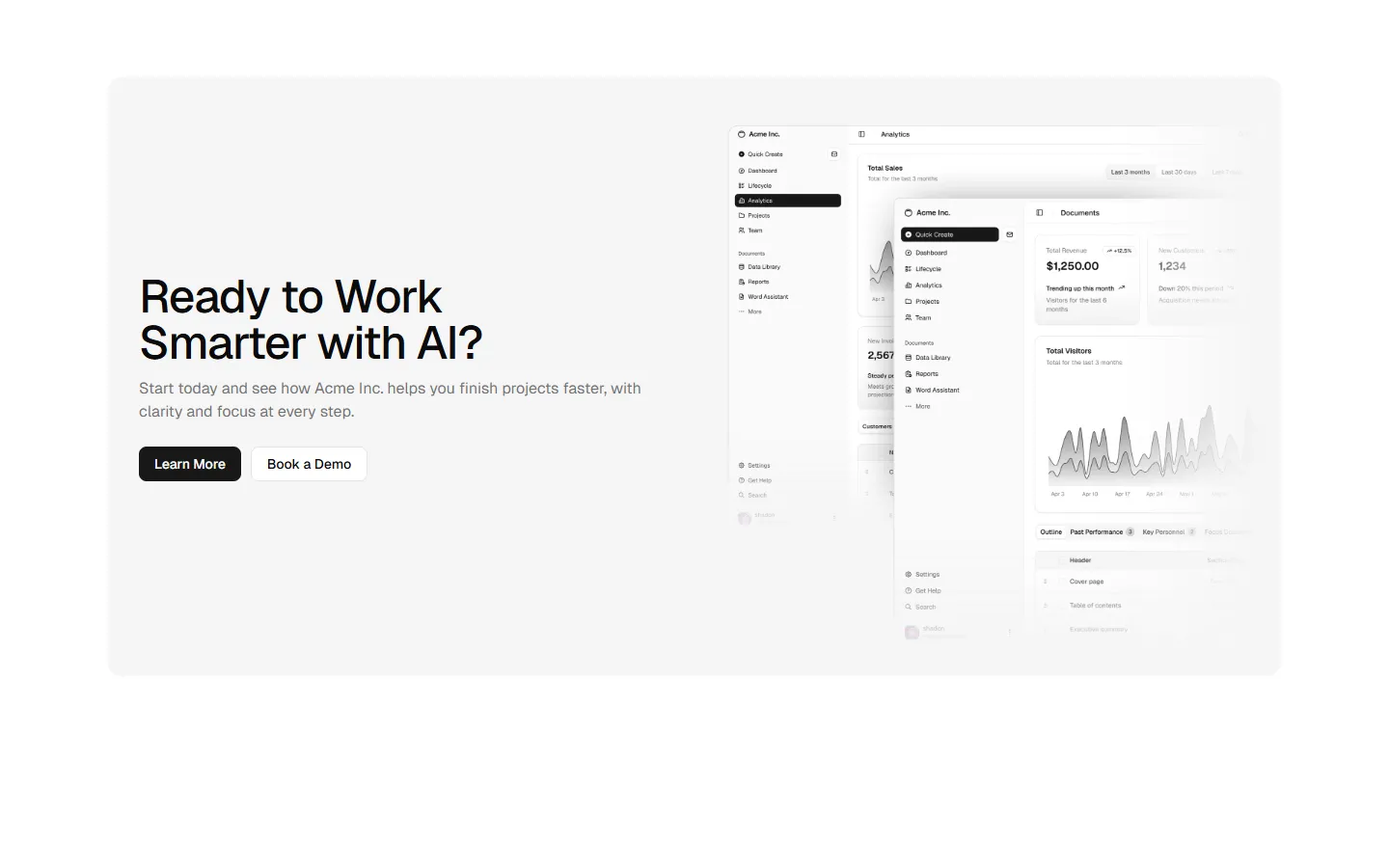
Feature-led split with primary visual
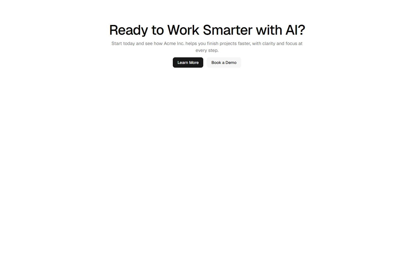
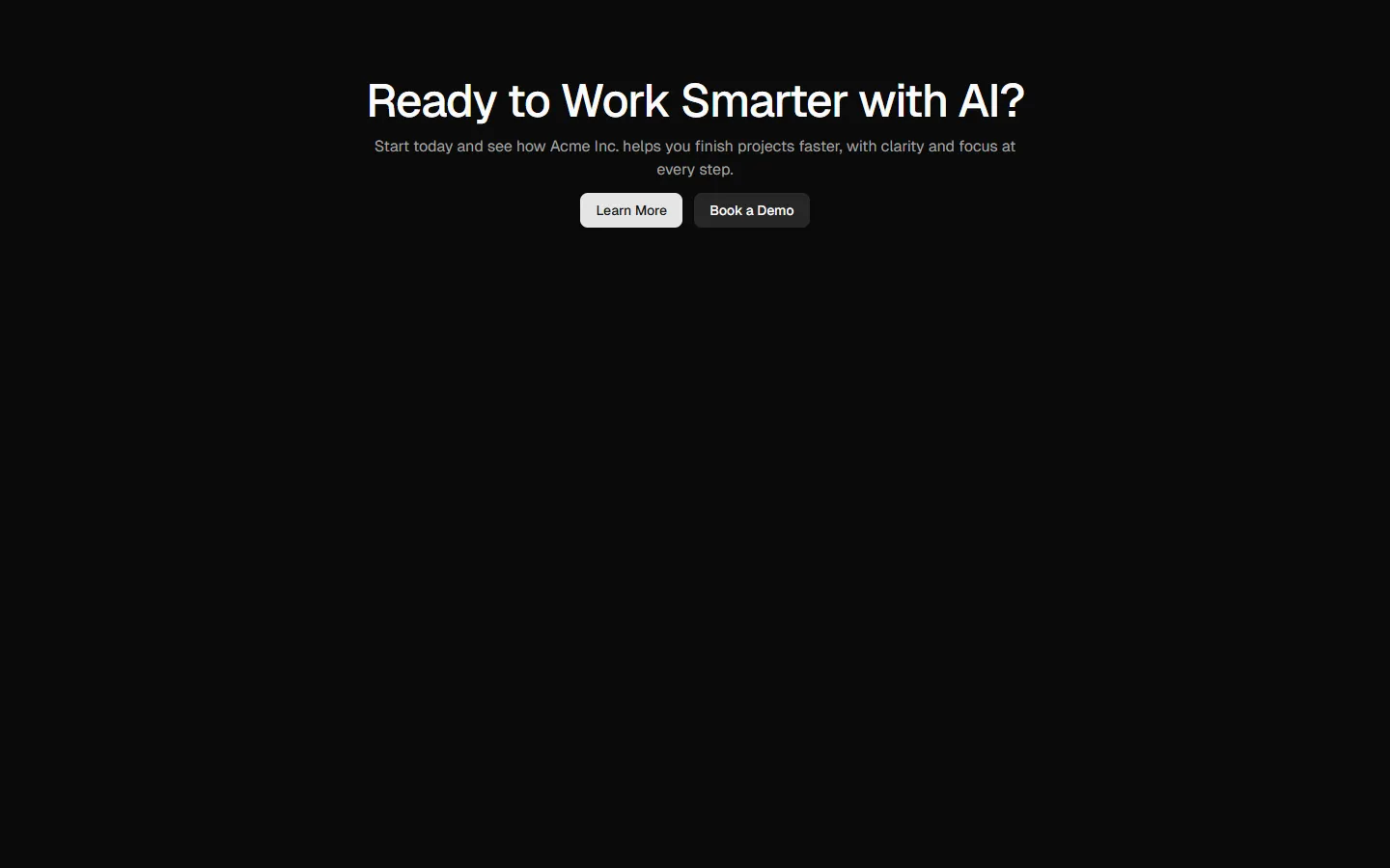
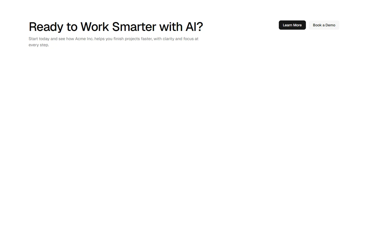
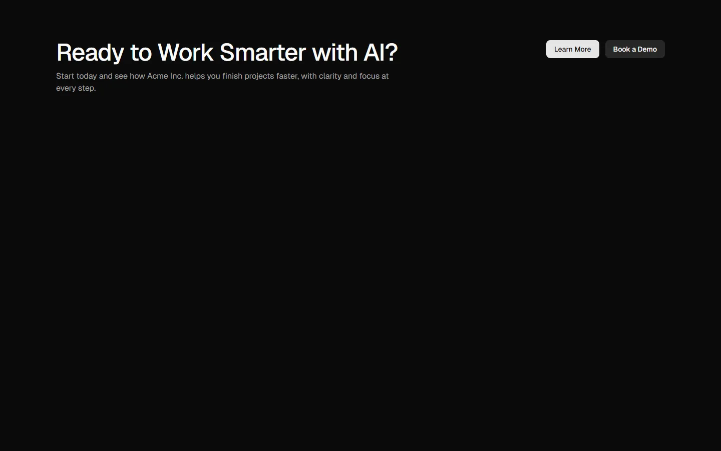
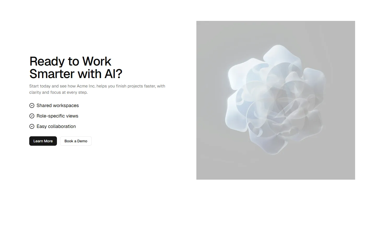
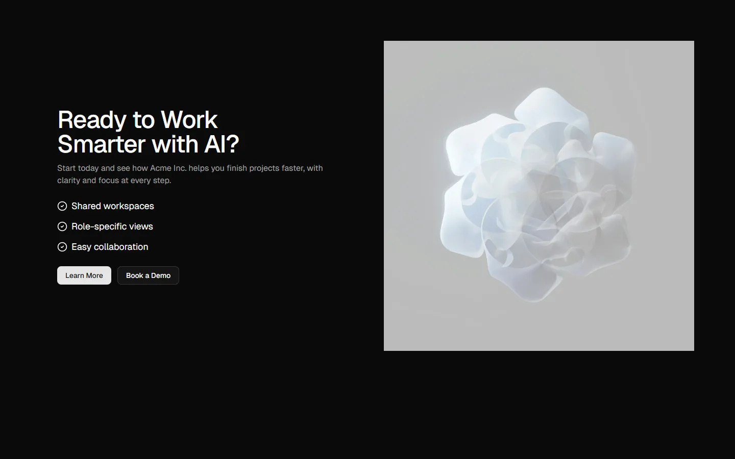
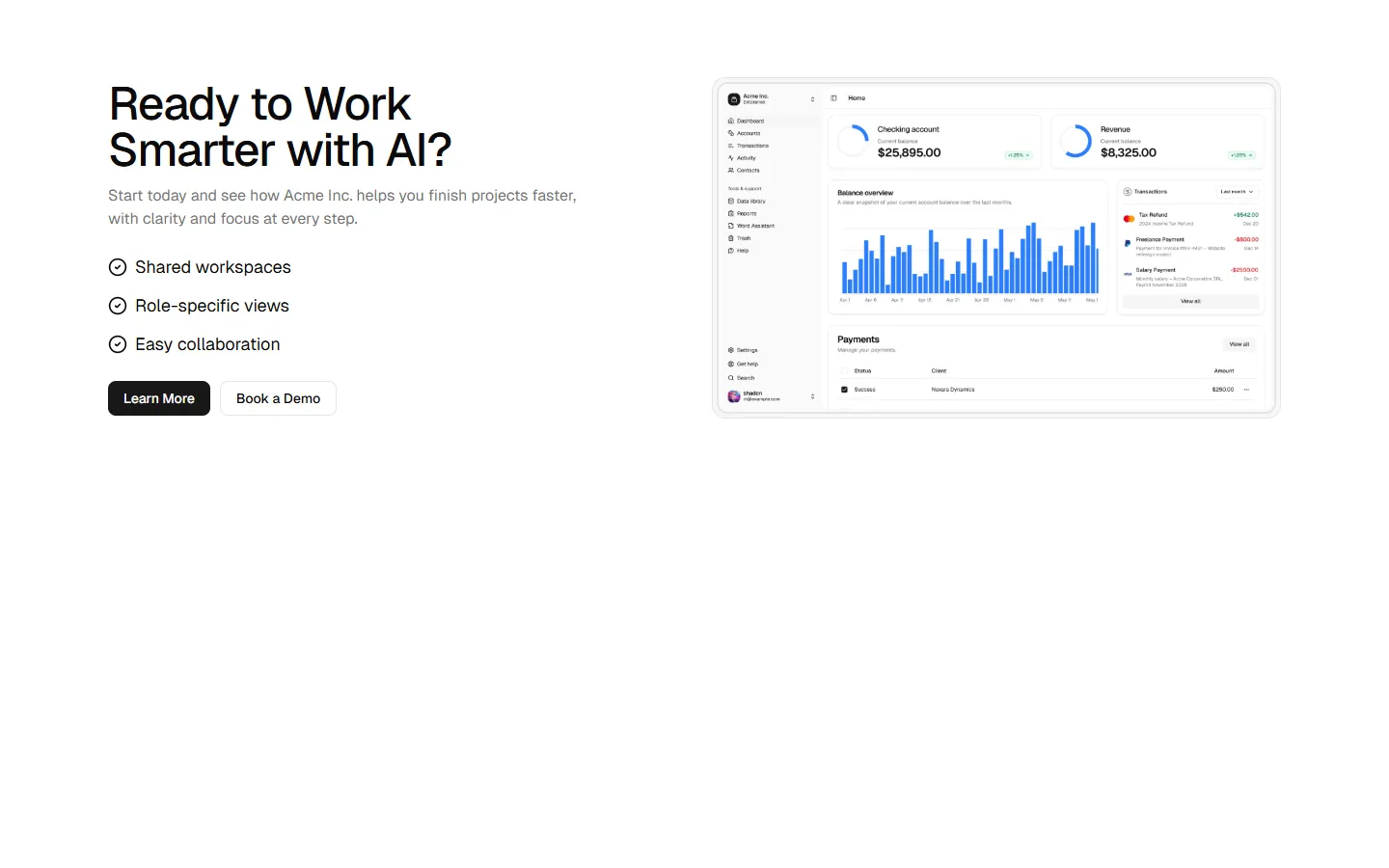
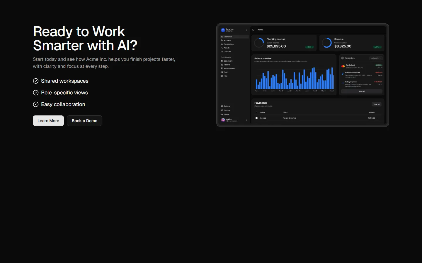
A split CTA layout anchored by a dominant visual panel, with supporting copy and a short feature list alongside. Emphasizes imagery first, then reinforces the action with structured text and clear primary and secondary buttons. Suitable when visual tone or brand feel needs to carry more weight than the copy.
CTA 6 is available as part of our Pro and Pro + React Design Systems. Get CTA 6
More CTA
Production-ready by default
Built with shadcn/ui conventions and designed for real projects.
Clean React components using Tailwind and modern shadcn patterns.
Add the block directly using the shadcn CLI.
Compatible with shadcn themes and token-based color systems.
Use shadcn MCP server right from your favorite AI tools.
Frequently Asked Questions
Quick FAQs to get you started.
Still have questions? See all FAQs, or get support.
Yes. They follow shadcn/ui structure and are built for real products.
