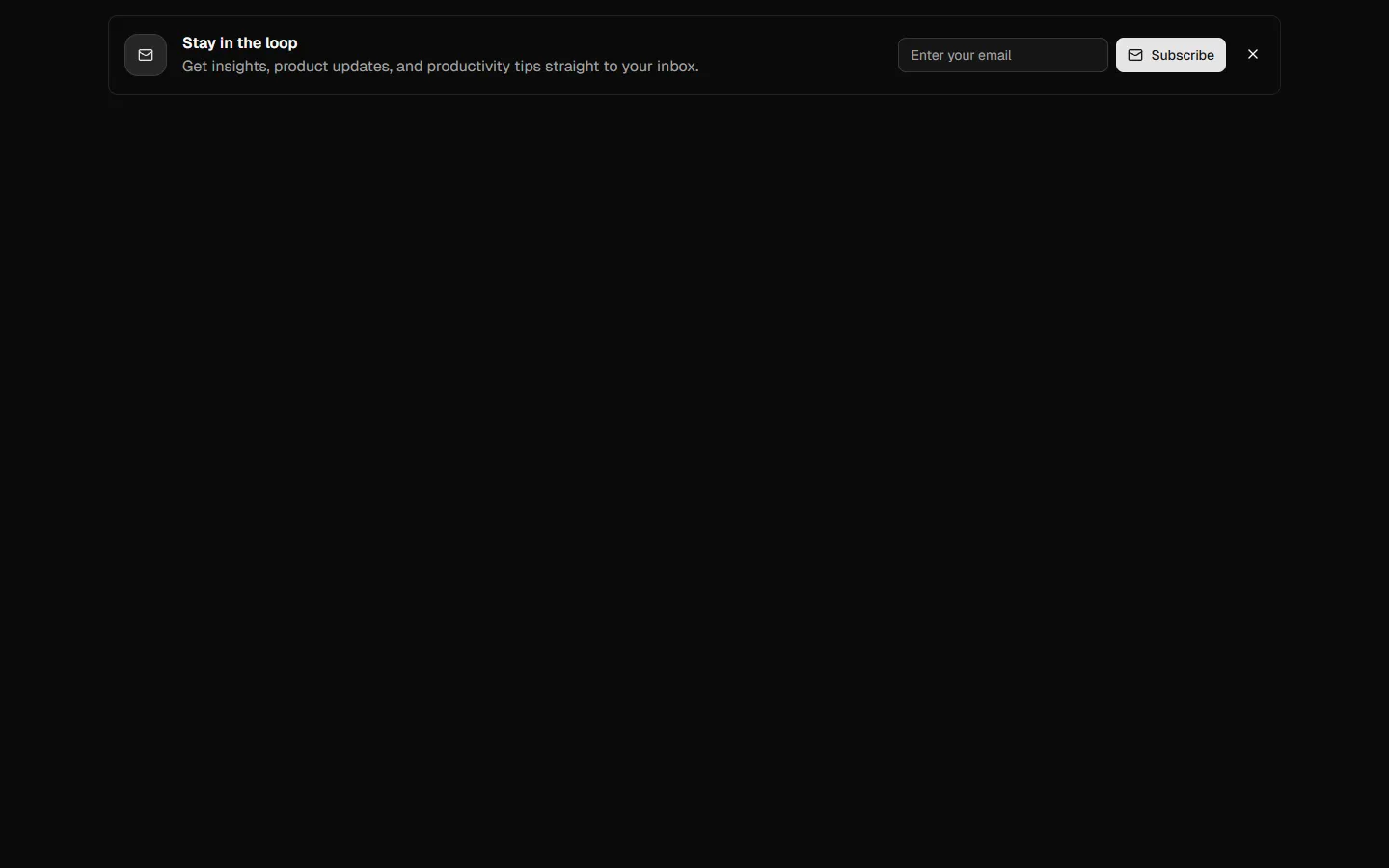
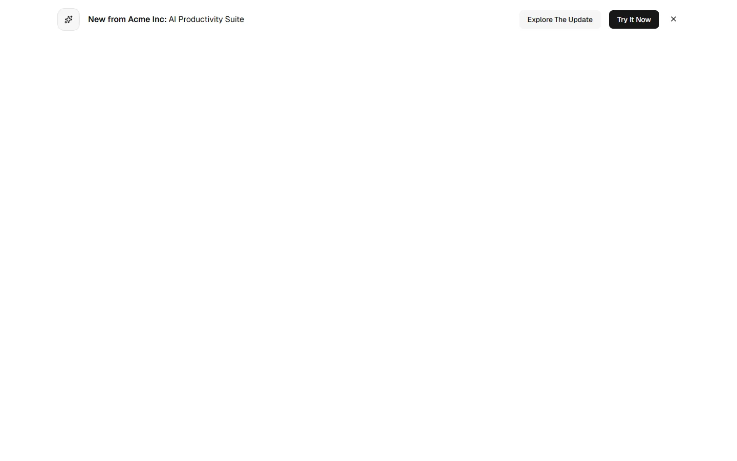
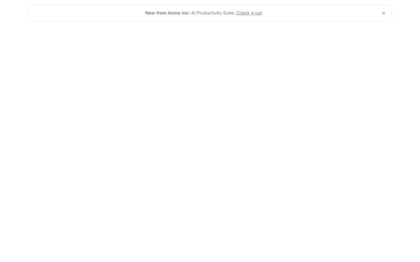
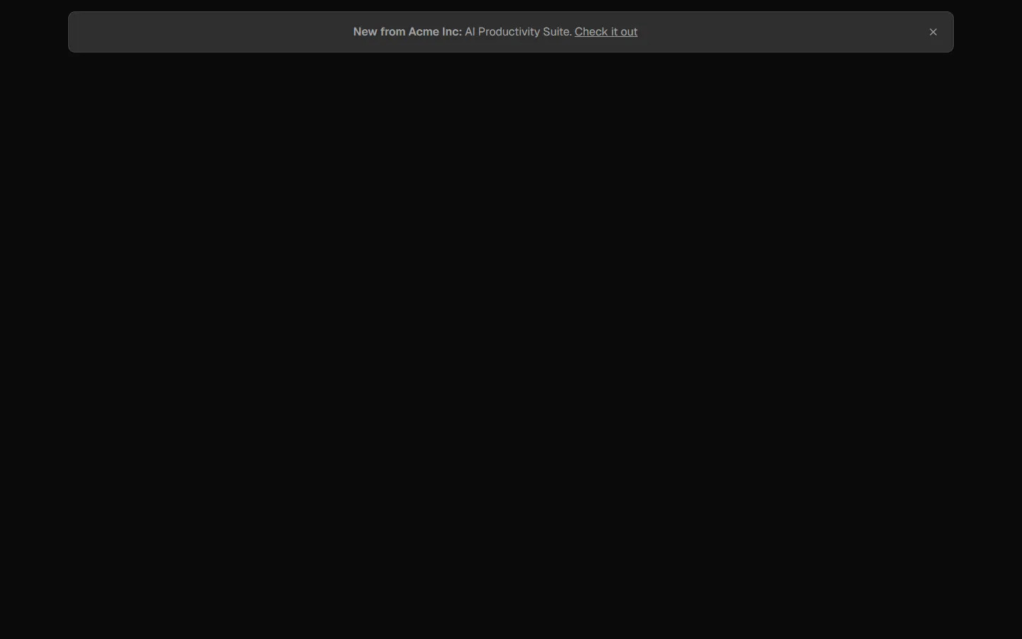
Banner 3
Inline announcement banner with actions
A low-height horizontal banner with an icon, short announcement text, and multiple call-to-action buttons, plus a dismiss control. Designed to span the content width and draw attention without blocking layout flow. Use for product updates, launches, or time-sensitive announcements that need clear next actions.
Banner 3 is available as part of our Pro and Pro + React Design Systems. Get Banner 3
More Banners


Production-ready by default
Built with shadcn/ui conventions and designed for real projects.
Clean React components using Tailwind and modern shadcn patterns.
Add the block directly using the shadcn CLI.
Compatible with shadcn themes and token-based color systems.
Use shadcn MCP server right from your favorite AI tools.
Frequently Asked Questions
Quick FAQs to get you started.
Still have questions? See all FAQs, or get support.
Yes. They follow shadcn/ui structure and are built for real products.
